
Typography guidelines
Don't use double spaces
Don't use spaces to align
Don't use double returns
Don't use hard returns within paragraphs
Don't use relative auto leading
Use "indent here" character sparingly
Use typographic quotes
Kern, kern, kern!
Fix low hyphens
Go easy on the tracking
Copy ragging
Hang punctuation in headlines
Don't use Zapf Dingbats in body copy
Related links
Never use double spaces to separate sentences. This is an outdated practice used by old fashioned typewriters. Modern fonts and applications require only one space. Using double spaces causes large gaps to appear in paragraphs of text, making the "colour" of the text block inconsistent (in typographic terms, "colour" refers to the overall visual density of the type in an area of text, in relation to the negative spaces within and around the text). Use the "find" tool to find and replace all double spaces with single spaces.
Never use multiple spaces to align, indent and position text. Always use proper paragraph formatting (shortcut: command-shift-F) to set tabs and "space before".
Extra returns can cause problems with style sheets, and can leave unwanted space in unexpected areas (For example, at the top of columns in multi-column documents when text reflows).
Don't use hard returns within paragraphs
Don't use hard returns to break lines within paragraphs: Always use soft returns (shift-return) instead. This ensures that when you use the "space before" or "space after" attributes, paragraphs won't break in unexpected places.
Don't use relative auto leading
The auto leading setting is determined by the application, not the document. Therefore, the leading will look different on different computers if the application settings are different.
Use "indent here" character sparingly
Try not to use the "indent here" character (command-backslash
[the key above the return key]). The results can be inconsistent, because
the spacing can change depending on the font face, font size, and any
tracking that may be applied to the text. Also, the "indent here"
character may move when reflowing text in large documents, creating unexpected
results.
The only acceptable exceptions are headlines and other instances where
it's only used for unique, localized text. For all other instances, use
paragraph formatting to set the "left indent" and "first
line" attributes (the second field will have a negative value of
the first field).
Make sure your QuarkXpress application preferences are set to "smart quotes" by default. This ensures that Quark always uses typographic quotation marks instead of inch marks. However, note that when pasting in text from other applications, Quark does not automatically apply this preference to the text: You will need to search and replace any inch marks with quotation marks after pasting.
Always kern headlines and other prominent areas of text. The bigger
the text, the tighter the kerning usually needs to be. Also, pay attention
to numbers, particularly pairs like 10: These pairs will almost always
need to be kerned in.


When typesetting numbers within headlines and prominent text (particularly
phone numbers), most fonts will set hyphens and dashes too low.
These characters will need to be baseline shifted up to the middle of
the cap hight.


You should generally not apply more than 2 or 3 units of tracking to a line of text. Anything more extreme will usually be visually discernible.
Try to have at least every other line of flush left copy extend to
the right edge of the text block. This will help fill out the text
block visually and aid in strengthening the design of a layout.


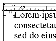
It is usually preferred to hang punctuations in headlines and other prominent areas of text. That is, hang quotation marks, periods, and commas outside the block of text. This strengthens the visual shape of the block of text.
When hanging the first quotation marks in a sentence in flush
left copy, there are a few different ways of going about it. You could
use the "indent here" character after the quotation marks. However,
this is not very exact, and can change the paragraph indent when the special
character moves in response to tracking, kerning, increasing or decreasing
the font size, and changing the font face. The "indent here"
character is best for headlines.
For body copy, the better solution is to use paragraph formatting. Set
a value for the "Left indent" field, and then set its negative
value for the "First line" field. Then add a tab after the quotation
mark: This will align the text after the quotation mark with the indent
of the paragraph.
Depending on the distance of the indent, however, you may find that there
is too much space between the quotation mark and the first letter. To
fix this, add a right aligned tab just before the indent, and set a tab
before the quotation mark. The following screenshot shows an example,
with the distances exagerated for the sake of clarity:
Don't use Zapf Dingbats in body copy
Don't use Zapf Dingbats for bullet lists. This can get in the way of
efficient use of style sheets. Applying a paragraph stylesheet will revert
the Zapf Dingbat character to the stylesheet's font. Even if you use a
character stylesheet for the Zapf Dingbat character, it can still be reverted
to a paragraph stylesheets's font if it's applied as "absolute"
[hold option as you click the stylesheet name].
If you are using simple shapes like ovals, squares, and triangles in your
bullet lists, then use picture boxes or polygons shapes instead, and copy
(with item tool) and paste them (with content tool) into
the text box.
If you're using more complex shapes like arrow heads and stars, outline
the character in Adobe Illustrator and import it into QuarkXpress as an
EPS picture, which you can then paste into the text box as an in-line
graphic. When doing this, you are, in effect, using the bullet character
as a style sheet: If you want to change the character, you only have to
change it once in the EPS file.
Related links:
The Font Site
(Style guides, typography rules, and related articles)
Counterspace
(Anatomy of letters, type classifications, and a history timeline of
type)
Type
Classification (Detailed information on type classification)
The
destination matters more than the journey (Good article about the
general principals of typography)
typographer.com
("A regularly updated news feed, series of articles,
interviews and tutorials covering the type industry.")
Use British spelling in your searches