|
INTRODUCTION.
Although,
there are many similarities between the design of a Web page and
the design of a traditional printed page, there are also some fundamental
differences. The differences can be attributed almost entirely
to the different publication media ~ the printed page or the computer
screen, the so called electronic page of the Web browser.
PAGE
SIZES.
If you are designing a printed page, you
generally know the size of the paper that will be used to publish
the document. Paper or page sizes have been standardised for many
years. Australia adopted the ISO 216 paper size standard when it
moved to the metric system of measurement in 1966.
So what has this to do with Web page design? Nothing directly, other
than to emphasise that the desktop publisher or graphic designer
is dealing with a fixed size format (usually in a portrait orientation)
for his or her publications. Even more valuable is the fact that
the aspect ratio of all formats within a single series remains constant
~ A3 is twice A4 which in turn is twice A5 etc.
For the Web page designer, the page formats are not fixed, in some
cases do not even retain the same aspect ratio and the viewing area
is almost exclusively oriented as landscape.
RESOLUTION
(THE ELECTRONIC PAGE LAYOUT.)
The
publication medium for the Web page developer is each individual
user's monitor or screen. These may vary not only in physical size,
but in resolution and also in their ability to accurately reproduce
colour.
The resolution of a screen signifies the number of dots or pixels
on the entire surface of the screen that can be individually addressed
by the video graphics system of the computer. For example, a 640
x 480 pixel screen is capable of displaying 640 distinct dots on
each of 480 lines, or 307,200 individual pixels. For the popular
screen sizes of 14, 15, 17 and 19-inch, this translates into a different
dots per inch (dpi) measurement depending on the size of the screen.
For example, a 15-inch VGA monitor (640x480) displays about 50 dots
per inch.
This means that higher screen resolutions (800 x 600 or 1024 x 768)
used on the same size screen, will display identical information
in a smaller physical area. For example, consider the three images
in Figure 1. I have altered the size of the images to represent
the relative difference between the three screen resolutions.
|
|
|
|
640
x 480
|
800
x 600 |
1024
x 768 |
Figure
1 ~ Relative Image Size For Each Resolution
This provides a graphic demonstration of the problems associated
with screen resolution. Even though the three commonly used settings
(640 x 480, 800 x 600 & 1024 x 768) retain the same aspect ratio
(640 / 480 = 1.33), because the image is a constant size, it appears
smaller as the resolution increases. The relative sizes of the screen
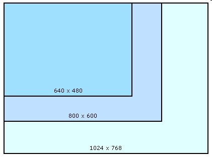
at each of the three resolutions is shown in Figure 2.
Figure
2 ~ Relative Screen Area for Each Resolution (to scale)
Unfortunately, even this does not represent the real situation as
far as the Web page developer is concerned. The actual area of the
screen available to display a page is also dependent the browser.
THE VIEWPORT
Each browser uses some of the available screen area for the title,
menu, tool and status bars, usually at the top and bottom of the
screen on a PC and on the side of the screen a Macintosh. Consequently,
the browser window, which is the developers' actual publication
space, is considerably smaller than the available screen. The term
"viewport", although
not universally adopted by Web designers, is often used to describe
the "safe" viewing area.
If you compare Figure 2 and Figure 3, both of which are drawn to
the same scale, you can quickly appreciate the problem facing the
Web designer. There is an enormous difference in the available screen
area between the highest and lowest resolutions.
A page
designed to fill the viewport at 640 x 480
will only occupy only 30% of
the available viewing area at 1024 x 768, and conversely,
only 30% of a page designed to fit a 1024 X 768 screen will be visible
at the lower resolution.
It is impossible to design a page that will be equally effective
at all three resolutions. The 640 x 480 resolution was very popular
on 14 inch screens, but these are slowly disappearing in favour
of 15 and 17 inch screens. The most popular resolution for these
sizes is 800 x 600 and most designers take a pragmatic approach
and optimise their design for the safe viewing area of 760 x 420.
This does not mean that the other resolutions can be ignored. On
the contrary, every effort should be made to make your design as
portable as possible from one resolution to another. However, the
reality is that no design will be equally effective at every resolution
and screen size.
COLOUR
(COLOUR AS A VARIABLE)
In order to explain the problems associated with colour display,
we need to re-cap on how computers handle colours. As you are probably
aware, computers store colours in a format known as RGB or Red,
Green, Blue. This means that all colours are represented as a combination
of the three base colours. Modern video graphics adaptors store
colours with 24-bit precision ~ 1 byte or 8 bits for each colour
channel (red, green and blue) which defines a palette of 16.7 million
different colours.
Each byte can store a value in the range 0-255 (or 00-FF hex). The
higher the value the more the channel is "on", and the
brighter the colour. For example, Red: 255 Green: 255 Blue: 255
(or FFFFFF hex) produces white ~ the brightest colour. At the other
end of the scale Red: 0 Green: 0 Blue: 0 (or 000000 hex) produces
black ~ the darkest colour. It follows that the colour 127,127,127
(or 7F7F7F hex) should be half as bright as 255,255,255. Ideally
a colour half as bright digitally should look half as bright on
your monitor.
Browser Safe Colours.
Many older colour systems can only display up to 256 colours (8-bit)
at a time. The effect of this is often visible as a "speckling"
of colors as the browser tries to approximate the true color at
any point in an image. This problem will gradually disappear as
older computers systems are replaced by later models. In the meantime,
in order to accommodate this, most browsers use colours from a fixed
"browser safe" palette.
This palette(click here for an example of the browser safe palette)
is based on the 8-bit colour palette of 256 colours. However, the
palette consists of only 216 colours in order to accommodate the
differences between Windows and the Macintosh operating systems,
both of which reserve some colours, but unfortunately not the same
ones. UNIX uses an entirely different group again.
The browser safe palette consists of 6 evenly spaced gradations
in red, green and blue and all their combinations. If a browser
is confronted with a colour outside this palette, it will adopt
the nearest colour from within the palette. For example, if you
set the page background to a colour which isn't in the browser safe
palette, you run the risk that the background will have different
colors depending on whether the computer is using indexed or true-color.
This problem is easily solved, simply stick with colours from the
browser safe palette wherever possible.
Monitor or Screen
Settings.
However, not so easily addressed is the way in which your selected
colours will be displayed on the monitor or screen. To a large extent
this will be determined by the screen settings. The Web page designer
has no control over the settings adopted by individual users.
Have a close look at the colour ranges in Figure 4. These represent
even steps of 10% in the red, green, blue and grey colour channels
from the 24-bit colour palette. The mid range grey (6 from the left
in row 4) represents the colour 127,127,127 (or 7F7F7F hex) as discussed
above. If your screen or monitor is adjusted correctly, the difference
between the steps should be distinct and even.
Figure 4 ~ 10% Colour Steps of Red, Green,
Blue and Grey.
| |
|
|
|
|
|
|
|
|
|
| |
|
|
|
|
|
|
|
|
|
| |
|
|
|
|
|
|
|
|
|
| |
|
|
|
|
|
|
|
|
|
If the black boxes at the end of each scale do not all appear as
a true black, then the brightness on your monitor is set too high.
If the white boxes at the other end of the scale are not all true
white, then the brightness is set too low.
If neither appears correctly, then your contrast is set too low.
Where brightness and contrast determine the colour display at the
upper and lower ends of the scale, the gamma setting will determine
the brightness across the middle of the range. The 50% grey (6 from
the left in row 4) should be visually half way between the white
and black and there should be even steps of tone going to white
on one side and to black on the other. If not, then your gamma setting
probably needs adjusting.
For computer screens "gamma" refers to the degree of contrast
between the mid-level grey values of an image. The default gamma
settings for PC and Macintosh monitors are different. The PC has
been designed for non colour critical office work, and as such does
not display an even spread of tone across the range ~ the dark colours
tend to run together. The Macintosh has built in gamma correction,
but this tends to err in the other direction. Colours that look
good on a PC will appear pale or washed out on a Macintosh and colours
that appear correctly on a Macintosh may be too dark on a PC.
The default gamma setting on a Macintosh is 1.8 compared to about
2.5 for a PC. The W3C has recommended a Web standard gamma setting
of 2.2, which is the same as the default for free to air television.
If you are creating or modifying images for a Web site, then it
is important to set the gamma to the recommended standard. In other
words, the image should look correct at the intermediate setting
of 2.2 if you want the best possible result across the likely range
of client settings.
Gamma correction is non-linear in nature, and is applied to the
Red, Green and Blue components of a colour separately. This not
only affects tone, but also colour. Across the gamut of possible
RGB values, the relative intensity of each colour will differ as
the gamma changes. As a result, the colour that you see on your
monitor may look quite different on another screen with a different
gamma setting.
The Web page developer does not have any control over the monitor
settings people use and there is no remote method for detecting
and correcting them. If you want the best possible tone and colour
fidelity across all computer platforms, you have to compromise by
working with a 2.2 gamma setting for each of the 3 colour components.
SUMMARY.
There are similarities between
the design principles of desk top publishing and Web pages. However,
there are also some important differences, which are due mainly
to the publication medium. The computer screen or browser viewport
is a variable medium in terms of size and display characteristics.
The designer has little or no control over these variables. As a
consequence, an effective Web page design will be a compromise in
order to best accommodate the variable nature of the medium.
| An Inroduction
to Web Design |
| This
is an assignment for TAFE - Modules: Select & Use Software Mult
Tool 3756C - Apply A Web Authoring Tool 3755G - compiled
by Richard Langley |
|