
WET #25: Maple Leaf, Palm Tree, and Pencil Icons
May 8-9, 1999
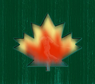 |
WET 25a: Outfield Fence Knothole (Canadian Style)
This first version of this weeks WET 25 is supposed to be a knothole in a Candian baseball stadium's outfield fence. The Toronto Bluejays are in the midst of a really hot game with a team whose favorite slugger (initials MM) is up to bat. I used only one of the 3 originals for this first version.
I selected the maple leaf icon, copied and pasted as a new layer, then used spray paint to splotch the flame colors on it, then used motion deformation in a variety of angles (adding more dabs of color once in a while) to come up with the flames. I left the shape selected through the whole process.
For the fence, I reversed my selection, copied and pasted that background shape as a new image. I rotated it 90 degrees, filled with a light green for the base, then used the darker green to paint "woodgrain" texture on it. I sharpened (I think twice) to bring out the grain. Then I rotated it back to the vertical and pasted it as a new layer over the fiery leaf image.
Next I reversed selection again so the leaf was selected. I added a drop shadow around the leaf of 2 pixels, using the lighter green. I used 1,1 then 1,-1 then -1,-1 then -1,1 all blurred about 2 and low opacity...about 30.
Then I reversed selection again(!) and used a drop shadow of black, 2,2 no blur to define the left side and downpointing of the "hole". I then used the light green at -1,-1 no blur, 100% opacity to highlight the right side and upward edges of the hole.
Last but not least, I cut out the picture of Mark Magwire from a previous wet (no, silly me, I hadn't saved a cut out version). Then I added it as a new layer and blended at 15% on "screen."
|
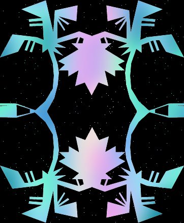 |
WET 25b: Mexican Sky Through the Old Palapa
This image reminds me of night skies in Puerto Vallarta's Old Town. I combined all three images to make the basic outline for this version (and used the same outline for versions 3 and 4).
I inverted color on all three images first so I had a black background and white shapes to work with. I used the 4-fold symmetry method with the palm tree to make the basic tile. Then I added two maple leaf designs at top center and bottom center, flipping the top one so they were symmetrical. I added a portion of the pencil at left center and right center, rotating both then mirroring the second for symmetry.
I next made a large gradient image of blended colors using the blur tool. I used aqua, green and blue smears of color on the outer thirds, and cream, pink and lilac for the center third. I used some gaussian blur, but mostly motion blur at various angles till I was pleased with the blending and gradient effect.
I then selected the black background from my symmetry design and placed it as a layer over the larger gradient image. I moved it around till I was satisfied with the color placement, then blended the layers at 99% "Dissolve" to get the starry sky effect. I merged visible, then trimmed away the excess color.
|
 |
WET 25c: Two by Two Golden Carving
I started with the same black and white tile that I made for version 2. This time, I used a monochromatic palette of 10 different gold tones to do the entire image. Click on the thumbnail above to see the full sized image.
I selected the white part and filled with my lightest gold. Then I went to Selections: Modify: Contract 2, then filled this new selection with the next darker color. I repeated this process of contracting 2, filling with a darker color, until I had used the darkest shade. Then I reversed and used the next lightest shade, and repeated until I reached the lightest color again. I kept going until there was nothing left to select in the white area.
Then I selected the black background and repeated the process until everything had been filled in with tones of gold. It was an interesting experiment, and I think the process has possibilities for use with multiple gradient colors.
|
 |
WET 25d: In the Manner of Huichol Yarn Painting
For Version 4 I used version 3, but used the Color Replacer to replace the various shades of gold with colors similar to those used by the Huichols of Mexico in their beautiful religious art.
Using the 2 pixel contractions resulted in the "yarn" effect (click on the thumbnail above to see the full impact) when these bright and contrasting colors were used instead of the gold monochrome.
|
Everything on this page was done in Paint Shop Pro 5, using only the original filters and functions supplied with the program.
|