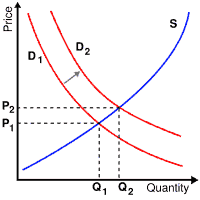
People increasing the quantity demanded at a given price is be referred to as an increase in demand . Increased demand can be represented on the graph as the curve being shifted right, because at each price point, a greater quantity is demanded, as from the initial curve D1 to the new curve D2 . An example of this would be more people suddenly wanting more coffee. In the diagram, this raises the equilibrium price from P1 to the higher P2 . This raises the equilibrium quantity from Q1 to the higher Q2 . In standard usage, a movement along a given demand curve can be described as a "change in the quantity demanded" to distinguish it from a "change in demand," that is, a shift of the curve. In the example above, there has been an increase in demand which has caused an in increase in ( (equilbrium) quantity. The increase in demand could also come from changing tastes, incomes, product information, fashions, and so forth.
Conversely, if the demand decreases , the opposite happens: a lefward shift of the curve. If the demand starts at D2 and then decreases to D1 , the price will decrease and the quantity will decrease. Notice that this is purely an effect of demand changing. The quantity supplied at each price is the same as before the demand shift (at both Q1 and Q2). The reason that the equilibrium quantity and price are different is the demand is different. At each point a greater amount is demanded (when there is a shift from D1 to D2). |