PHOTO AND GRAPHICS REFERENCE PAGE
This photograph shows cave paintings created by early man in France
approximately 15,000 years ago. They are one of the earliest records
of visual communication and graphic design.

Lines can vary tremendously in width and size. The use of line in this
manner creates
a look of "contrast" in both size and darkness, as well as creating a pattern.

This illustration demonstrates how positive and negative space work.The candlestick holder is clearly illustrated, or is the illustration actually two persons face to face?

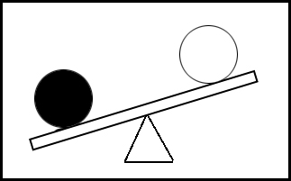
The black circle in the illustration will look "heavier" than the white circle.
Therefore, darker objects will usually draw more attention on a page, than
white objects.
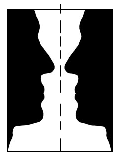
In this illustration, if an imaginary line is drawn down the center of this page, there is
the same
type of image on each side of the line. That means that the "visual weight" is
the same on both sides. The term that means "same on both sides, is
"symmetry". Therefore we say that a formal design is "symmetrical".
This is called "formal balance". It is usually static with not much movement.
You MUST fill out a Work Report every day UNLESS
your teacher says it is not necessary for a particular day. The form is actually a full
size sheet of paper. You will find them on the file cabinet in the front of the room. You
MUST place it in the file for your session and NEVER take it home. These are graded by
your teacher every day! If you miss five of these in a marking period or
course, you will receive points off of your attitude grade. DON'T FORGET!!
Look over the copy shown here. It contains some instructions for you.
Then, ASK YOUR INSTRUCTOR FOR A WORK REPORT TO FILL OUT NOW!!!

Below is an enlargement of a one week section of your teacher's grade sheets. Look at it
closely. This is the place where your individual grades will be
recorded. You will not always have a test or project due every day, so there will be some
areas that do stay blank or get "lined out". "Written Tests" is
where your quiz and test grades will be recorded. "Lab Quality"
is the area that project grades get recorded. "Attitude" is your daily grade for
your attitude in class towards your work, teacher and classmates. "Lab
Quantity" is the actual work completed during a particular day. "Related
Math" and "Related English" are written
assignment grades for those areas. You may ask for additional assistance in these areas
from our Related Skill Teachers. "Related Science" may come
from some written assignments, but in this course, the grade is computed by averaging your
Notebook Grade, Project Grades and Test Grades. Notice that if the student had gotten 4's
instead of 0's, the student would still have an "A" average. Grades and
attendance go hand in hand.

This is a copy of the NEW Classroom Discipline Form. It was created through a committee of teachers and administrators, to allow teachers to deal with minor discipline problems, without involving the office. Teachers can now recommend discipline points be awarded, without sending a student to the office. The form is sent to the office of the Vice Principal, it is reviewed by him, and he imposes the points as recommended. It is to effectively deal with discipline, without a long, drawn out process, and to help to document discipline problems. The student's home school and parents will be sent a copy of this form as well.


In informal balance, if you draw an imaginary line down the middle, the design does not
look the same on both sides. Just because the ad is not formally balanced, doesn't mean
that it is not balanced. It means that the visual weight is distributed evenly around the
page without having a "mirrored" or "symmetrical" look. This type of
layout is used to create a more modern look, with more eye movement around the ad.
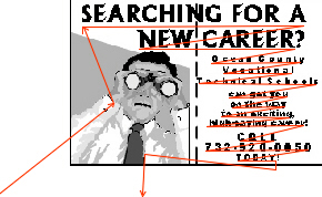
This illustration uses a red line to show how a person's eyes might scan this ad. The person usually looks first at the illustration. It is used as an attention-getter. Then the large, bold type in the headline will attract the eye. Our normal left-to-right reading scan will then take over. A smart designer uses this information to lay out a page or design to keep the reader's eye focused on the information, while getting the reader to read the advertisement content. At the bottom, the reader's eye moves off to another part of the page.

Notice the harmony that is used in the design of this ad. The ad is advertising a sale of snow skis. We see an illustration of a skier in the ad. We see a typestyle that shows a chilled or icy effect. There are snow covered mountains. The letters are sloped for contrast, and to increase the effect of a skiing theme, like the slope of a mountainside. ALL OF THESE PUT TOGETHER CREATE THE FEELING OF HARMONY!

Here's the same sale ad with the typestyle and illustration changed. It
does not have good harmony. Even if this is "Bob" of
BOB'S, most people won't know that. The typestyle is a "Broadway" style. It
doesn't fit into the whole theme. Use your head and common sense. If you are designing an
ad for skis and ski boots, 9 times out of 10, people want to see skis and ski boots in it.
GO BACK

Typestyle unity is critical to designing success. Resist the urge to use too many typestyles. They may get confusing and difficult to read. NEVER, NEVER, NEVER SET "SCRIPT" IN ALL CAPITALS!!!! Look at the headline. It is difficult to read and if we didn't already know what it said, we might not be able to figure it out. NEVER set "Old English" or "Calligraphy" fonts in all capitals, either. Typestyle unity makes for easier reading.

The example above shows a business card design that exhibits poor proportion. The headline is much too large. The address and phone number are too small and difficult to read. The illustration is also too large.

This design shows an improved design with better proportion throughout. The elements are more in proportion, and therefore easier to read. On a business card, the phone number is important. The number is now easier to read.