Photoshop

2007

[Full View]
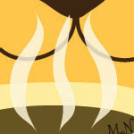
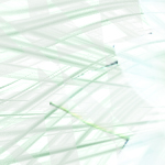
This is one of my assignments from Computer Graphics 1. We had to make a collage about things we liked, and this is what I came up with. I used a lot of the objects show/carry even more objects that I like. What better way than to introduce myself through collage? It is bad quality since I used to not care much about what images I chose to use.

[Full View]
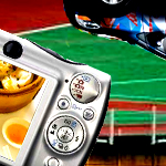
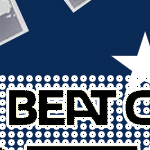
In Computer Graphics 1, we had to make a poster of our favorite music artists. I chose Beat Crusaders because at that time I was really into their music and I loved how they always work those silly masks of their face in all of their performances and music videos.

[Full View]
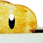
This is a redo of my Toastee logo from Illustrator. My teacher told us that we had to redo our logo in Photoshop... Um.. Well I wasn't very creative of re-creating an image of a cartoon toast in Photoshop, but I did try. Lets just say I got a C on this because of the negative space. Logos are supposed to be simple anyways, right?

[Full View]
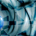
I was just playing around and photoshop and got this. I do enjoy making these abstract things and I use them sometimes (if I remember to) for layouts or other designs.

[Full View]
Another abstract project.

[Full View]
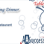
This flyer was used for AASuccess's fundraising dinner in July 2007. May I add that it went through at least seven or eight different revisions. This is the first time that I've ever volunteered my work to any group. Notice how I said volunteered. Well, as a student, even if I'm not being paid, I am expected to change it 1000x as wanted as if the clients were paying me. And I obliged, I wasn't even recognized for it ;__;~ Oh well. Brushes used were not mine.

[Full View]
This is the ticket design that was used for AASuccess's fundraising dinner in July 2007. Matches the flyer :). Brushes used were not mine.

[Full View]
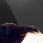
My first small project in my Visual Communications class. We just had to make a poster of ourselves, a negative one (which is this) and a positive one (which I never finished). In this one, its obviously really simple since we were just getting used to Photoshop, again. The lyrics are from Space Sonic by Ellegarden (my favorite band EVER).

[Full View]
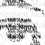
My first real project in Visual Communications. We had to do a "typography" project. For this I had to use many different layers of different sizes and opacities of my typed name.

[Full View]
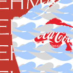
This is the second typography project. Although, instead of using text, I had to used logos of things that I'm "made out of" to represent me. "Made out of" as in, things I eat, use, wear, etc.

Back to top

2008

[Full View]
This is the second "professional" logo I've done in my VC class. It is intended for the Annandale Chamber of Commerce if they are to choose this logo. They requested my VC class to do it since we were working on the logos for Beanetix.

[Full View]
This is a simple logo I made for my personal online blog at blogspot.com. The kanji means "falling in love" in Chinese or "forming and attachment" in Japanese, and I put it inside a circle because circles usually represent "continuity" or "eternity". The "X" in front is just a part of my blog name as well as the first letter of my middle name. So far I've only used it to watermark the photos that I upload onto there.

[Full View]
This is my personal logo for my "creations". I guess if I were to have a business card, this is the image that would go on it. Basically, I just drew a girl (that coincidentally has the same hairstyle as me) and earphones around her head with my initials inside and added "productions" underneath. Seems simple enough.

Back to top

Illustrator

2006

[Full View]
This is one of my first images starting out in Computer Graphics 1 and also in Illustrator. Its actually really bad compared to my current work. I couldn't draw lines straight, and everything was crooked because since I drew crooked on the paper, and scanned it crooked, I ended up tracing it crooked. This is before I realized I could use the scan as a base instead of tracing it directly.

[Full View]
For my CG1 class, we had to make a "pretend" business and make a logo for it. I decided to do toast, because at that time I had this random idea to make-up a "pretend" toast business that sells different type of toast and toast toppings. Adorable?

Back to top

2007

[Full View]
This was a project we had to do for our school. The culinary arts program sometimes opened up during lunch to cook for teachers and they were called the Paw Print Grill, however, they never had a logo. This is a small portion and this is one of the proto-type logos I made, and later we'll be making menus and place cards to add on to this collection.

Back to top

2008

[Full View]
A new coffee shop opened in Annandale, and they were called Beanetics. They freshly roast coffee and brew coffee, and decided to partner with Falls Church High School so that we would have our own blend to market. It was named Jaguar Joe and my VC class had to make logos for it. I was put in the top three finalists, and now its the official logo for Jaguar Joe. Thats right, if you ever see this image on a coffee bag somewhere, just remember I made it ;D. Also, the colors seemed to be messed up when I upload it on my computer. I assure you, are colors are not this blinding in real life.

Back to top