|
|
||||||
|
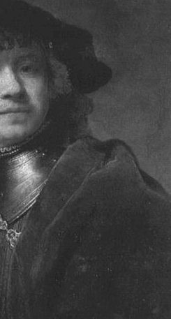
The painting of fur, linen, cotton, velvet, silk, satin, gauzes and other diaphanous materials
Drawing the edges and the folds ... the thickness and pliability (softness) of the cloth determines the size and shape of the folds.
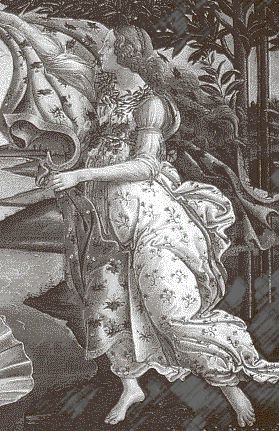
Silk and satin are thin and fold easily with narrow and sometimes a chaos of activity where directions alter. They cling to the shape they cover and faithfully follow the contours - be they straight or curved. Here I have simplified a part of a Virgil Elliott painting to show the underlying structure of the folds.
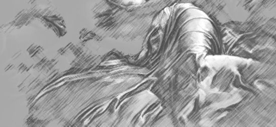
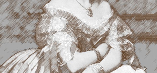
Gauzes are either thin linen or diaphanous silk in pliability and should be lightly drawn accordingly. A soft shawl will follow a contour while a starched gauze will resist. Below is a starched gauze over a linen dress.
Before you begin drawing a garment observe the broadest and narrowest folds. The complicated folds should be simplified at the drawing stage. |

|
Virgil Elliott is a master painter of silks, satins, and
diaphanous gauzes (as well as many other things). He
offers the following advice: 'The first thing I do is to arrange the cloth in a way that suits my sense of aesthetics, so that its form indicates what is beneath it, and at the same time adds another element of eye-pleasing shapes to the composition which comprise areas of secondary interest and lead the viewer's eye from the main focal point, around the picture in a graceful pattern (ideally), which ends up back at the main focal point and starts the process again. It should reveal key forms in some places, only suggest them in others, and conceal points of interest in other places (mystery increases interest), while at the same time incorporating its own interesting and/or pretty shapes into the overall. In other words, I usually design the shapes to begin with, before I start to draw or paint, unless by happy accident they have already assumed a pleasing configuration. Often I use a mannequin for this, as models tend to object to having the cloth attached here and there with straight pins, and won't hold still long enough. When I use a live model for the cloth, I draw very quickly to get the shapes noted before she or he has to move for whatever reason, then I follow the drawing, which is generally just a guide sketch at this point, when the model is back from the bathroom or whatever, to rearrange the cloth back the way it was. I then follow the sketch in designing the actual painting, but often deviate from it wherever I see a way to improve the shapes further.'
Does your drawing suggest the pliability of the material? If it does then you need no enhancement in the drawing stage. |
GO TO .... lesson 2 and texture
lesson menu