|
2. Texture
this is the roughness or smoothness of the material and us usually apparent in two places, the boundaries or edges of the garment or at its general mass where light values change (turning points -basic lesson on texture).
a) Edge : silk obviously can combine the highest degree of smoothness with thinness of material so its edge treatment is the sharpest. Next would be linen or cotton gauze where the edge would appear a thin line. Note - light will often reflect from a cut or bare edge. Fur is the other extreme.
b) Turning points: here texture can be shown as individual weaves, hair, cotton or thread stand proud of the material and cast their own minute shadow. The length of the shadow being determined by the sharpness of the fold (see below). This is where the professional artist makes judicious use of the many brushes at his disposal as well as carefully adjusting the paint to the viscosity necessary for the appropriate effect. Some will paint wet into wet and others paint over dry surfaces. Still others prefer to use glazes, palette knives or a multitude of instruments.
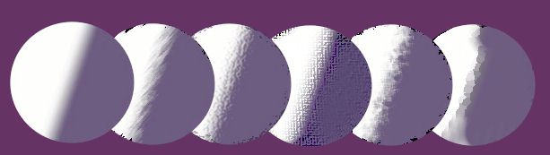
Can you decide from the above examples which is silk, cotton, linen and velvet?
3. Value differences: Tonal - this is the value difference on the grey scale between the highlights and the shadows of the material being painted.
This factor should be approached completely independently of any color considerations and for practical purposes we shall assume one light source and one direction (not backlighting). The artist will usually limit these tonal divisions to a minimum of two and a maximun of four with the following approximations;
Fur and wool - two - with little value difference between highlight and shadow
Flax-linen and heavy cotton
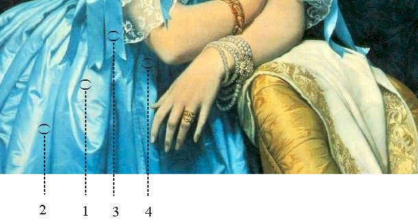
- three - values between highlights and middletones closest Satin - three - values evenly spread (note that highly reflective materials like silk or satin are very prone to secondary surface reflections.)
Silk, taffeta and satin- four - values closer at the highlight end. See blue taffeta dress below.
Gauze and diaphanous silks - two (the third one here is transparency or the form beneath) values between highlights and middletones close.
Virgil Elliott writes: 'The key is to understand that light on diaphanous cloth renders it more opaque, and thereby obscures more of what is underneath, while in shadows it is more transparent, allowing more of what is under it or behind it to show through. Also the opacity/transparency is affected by the angle of the cloth relative to our line of sight. Parallel to the line of sight it is more opaque, and perpendicular to it it is more transparent, with varying degrees in between those extremes.'
Velvet - two + - folds work light a bit differently than other fabrics.
Secondary light
- This is the ability of a surface to absorb light rays reflected from another nearby surface(such as the yellow chair below). The artist can then insert complements in the shadows or between the tonal divisions.
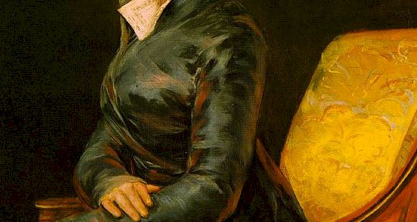
Here in this detail from a Goya painting there are secondary and tertiary reflected colors which provides a richness almost beyond the imagination. Even more so because the initial color of the dress is so bland with only two basic value changes. There are those who will undoubtedly claim they see more.
Virgil Elliott notes ' Whereas it is a popular practice to place complements in shadows, it is not the way light works in reality. The main influence on the color of shadows is the color of the secondary light, which could be any color. Only in highly reflective surfaces like satin or polished metal or glass will reflected color register noticeably in the middletones.'
|