|
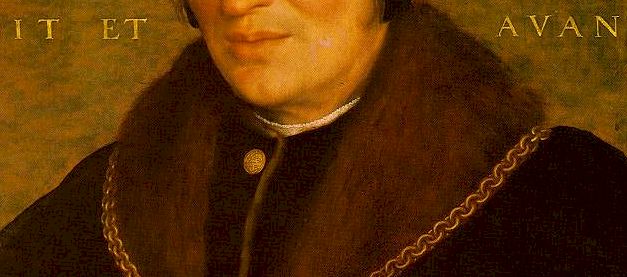
Grisaille painting: the classic method of painting sub-forms in shades of grey paint in an effort to divide the processes of painting into easy stages. This is the first stage after drawing and its purpose is to render value or tonal differences between the forms. Strictly it means ‘painting in grey,’ but for practical purposes artists usually use favourite browns or muted blue greys. I use a mix of raw umber and cerulean. Grisaille painting is often a precursor to numerous applications of transparent paints either separated by glazes or as, many use today, a suspension in a medium or glaze. If the artist is intent on painting alla prima (paint raw from the tube) and wants to use opaque colors then the grisaille painting is still valuable as all he or she needs to do is to match the overlay color ( usually by mixing it on the palette) with the grey value already set down. In this instance some impressionists often underpainted a muted compliment of the final layer allowing bits and pieces to emerge.
Virgil Elliott: writes ‘If the shapes in the cloth are fairly intricate, I may underpaint in greys before using color. This allows a very high degree of refinement. (If I am after a more painterly effect I dispense with the underpainting and do it alla prima with large hog-bristle brushes, using larger amounts of paint on a somewhat rougher canvas.'
1. Fur and woollens - a richer than usual effect can be achieved using a few layers of transparent darks over a textural layer that renders the edge texture. The turning point texture is usually introduced in one of the final coats as it gains definition from laying on top. Do not overdo the textural effect - see previous lesson on
painting hair.
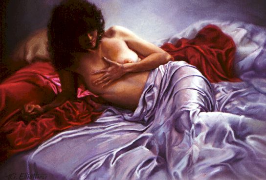
2. Linen and cotton: (tablecloth below) for wet - in -wet painting of linen I lay in the middle tones first then the lights and darks , working forward and backward wet- into-wet and ignoring the smaller details until the larger shapes of the three main value masses are blocked in. I will work them together where they meet, then working back into each and introducing the more subtle variations of value and color. At this stage, and this is a good tip for any cloth or clothing. Try and restrain the temptation to expand the value and color range. You must leave scope to add the dramatic differences when later unifying the whole painting. Remember - it is far easier to add highlights later than remove them.
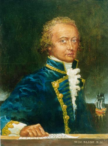
4. Virgil Elloitt: - 'Satin or soft silk may also be rendered simply, in one step, beginning with three categories of light: shadow, middletone, and highlight. The shadows should be put in first, and applied thinly and more or less transparently; then the middletones, opaquely; then the highlights, opaquely, all in general manner initially. The edge between the transparent shadow and opaque middletone may need a zone of dark opaque paint to create a smooth transition from shadow to light. After the three main categories of light are blocked in, they may each be refined further, with secondary light added to the shadows, reflected color added to the middletones, and varying degrees of light in the most brightly- lit areas. All of this is best accomplished in one sitting, wet-into-wet. In the end, the paint should be thickest in the lightest lights, and thinnest in the darkest darks. Virgil Elliott's painting below demonstrates his mastery of the silk - satin technique.
5. Diaphanous - Remember Virgil Elliott: said 'The key is to understand that light on diaphanous cloth renders it more opaque, and thereby obscures more of what is underneath, while in shadows it is more transparent, allowing more of what is under it or behind it to show through. The diaphanous textures can also be done this way as well, by painting the cloth and what shows through it at the same time.
|
||||