|
|
||||||||||||||||||||||||||
| Using colors and developing a color scheme
for your painting is a lot easier than you think. Many more color combinations
work than don't work. Let us think more on the music analogy where each
note has pitch, force and length - just as in painting each color has hue,
value and saturation. A chord in music is a collection of notes that harmonise. Similar to music I like to think paintings can be composed of color chords. A painting 'chord' could then be thought of as a collection of colors that harmonise. But what causes colors to harmonise? Below: Colors of similar hue, value and saturation will harmonise just as will musical notes one octave apart. The colors must for they are the equivalent! Below: Colors of similar value and hue (but different saturation) will harmonise. Any of these 'harmonies' can be utilised in a painting as either major or minor accents (chords). Below: Colors of similar value (but different hue and saturation) will harmonise. This would describe a painting of colors with no value difference. No forms would be discernible just hues. We define a high key painting as one with the 'majority' of the painting surface painted with high value colors. Some years ago a particular paint manufacturer produced (modular) colors labled with their value so artists could more easily harmonise their color schemes! Below: Colors of similar hue (but different value and saturation) will harmonise. This would be equivalent to a painting done in sepia tones.
When considering this scheme also remember the unifying
effect of the discordant note. Painters use this is when applying
‘spot’ compliments (opposites to the unifying hue) which, as in jazz music,
has the effect of underlining or exaggerating the unity of the rest. In the painting above
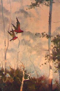
I could have done this by making the bird's wings greener (removing all the red from that hue). There is nothing psychological
in this, it merely is a practical tool for the painter to employ if the painting seems to lack some vibrancy. Turner was the
master of this effect. He would create a huge canvas of reds, oranges and
golds then place in a strategic spot of blue - or vice versa. The result can
have viewers circling and muttering words like genius, awe-inspiring and unforgettable!
From a painter's point of view all it requires is great control and restraint - holding
back until that last, final, daub of pure paint. That is the real secret to painting with color - the understated build up, the flat featureless, bland thing that has taken six terrible controlled months to produce then becomes a vibrant masterpiece in the last five minutes.
This brings me back to saturation. This is
not, as most painters would have you believe, a post exhibition, or after
dark activity. Saturation, sometimes called chroma, is the redness of the
red or the difference between a pale blue and a deep prussian blue.
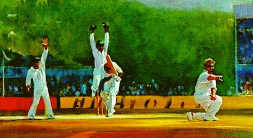
My action painting of cricketers in the West Indies has highly saturated hues (calypso colors) but note how all their values are similar. The red is separated from the dominant green and the white uniforms provide the unifying force. You can get away with a lot if you utilise high contrast neutrals! The major chord (the green, red, blue and yellow hues of similar value) is played again in the white of the uniforms where it is repeated in a 'higher key'.
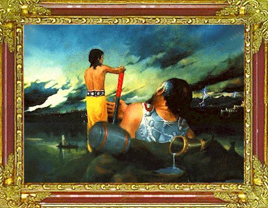
When color becomes highly saturated (as in the yellow toga above) it begins to elicit more attention. In this painting 'Thor' I have used colors of similar hues but differing values and saturations. Similar blues appear in the sky breastplate and hammer, yellows in sky water and toga, reds in the flesh and twice in the hammer. These are all minor chords. The major chord is the green - red combination of similar values. We cannot talk about saturation without discussing value. Value is what we do when we make drawings and shade them. It is the method we use to define form. If drawing is ‘line’ then as soon as we shade that line we create value differences, and a third dimension. So the third element, when describing most colors, is value. Value, as stated previously, is the blackness or whiteness of a color (scaled 1-10). Most hues tend to darken with increased saturation. If you desire to make pleasing two dimensional color compositions you can do so with chords of equal value or similar hues. This is useful and great fun but to make a painting with 'depth' we will also need to match color 'values' therefore we must consider how best to 'mix' the values we want. Would you expect a value five red mixed in equal amounts with a value five yellow to produce a value five orange or a value five red mixed with a value five blue will produce a value five purple? STUDENT ACTIVITY:I asked: 'Would you expect a value five red mixed in equal amounts with a value five yellow to produce a value five orange or a value five red mixed with a value five blue will produce a value five purple?' Do this on your palette and determine the result. Also do the same with paints of differing values to see whether they 'average' their values. Write up your results. Allow 40min. |