"Changes in trading volume give you important information about changes in market sentiment."
"Minute-by-minute trading volume shows reversal points in the market, helping you know when to buy and sell!"
MarketVolume’s proprietary technologies give you unique insight into market directions.
Stock Volume is the daily number of shares of a security that change hands between a buyer and a seller.
Index Volume is the sum total volume of all stocks included in the index. Therefore, S&P 500 Volume is the sum total volume of all 500 stocks in the S&P 500 index. MarketVolume's Index Volume Indicators are the result of technical analysis based on the combined volume of all stocks in a particular index. This makes these indicators an extremely accurate portrayal of overall market activity in real time. By using MarketVolume's Index Volume Indicators, you will have access to real-time, up-to-the-minute volume data for the major indexes, such as the Dow Jones Industrials, the S&P 100, the NASDAQ 100 and the S&P 500.
With these indicators you will know when it's the right time to buy or sell your security. It doesn't matter if you are not trading an index-derived security, as most securities follow the trend of the major indexes.
Exchange Volume is the sum total volume of all stocks in a particular Exchange. MarketVolume's Exchange Volume indicators are the result of technical analysis based on the combined volume of all stocks in particular exchanges. MV give you signals of market change as easily understandable charts and analyze in real-time over 11,000 stocks on the NYSE, NASDAQ, and AMEX exchanges.
MarketVolume's Exchange Volume indicators are excellent tools for informing investors where the whole market is going. their signals are accurate portrayals of the market.
They created their own special brand of volume indicators specially targeted towards specific sectors of the market. The market sectors represented by these indicators range from the high-flying tech stocks to down-to-earth blue chips. They are based on technical analysis of the volume of all stocks in certain industry groups, such as internet stocks or blue chip stocks. By using the MV Select indicators you can diversify your investments with confidence.
When you look at a chart for a major market index such as the S&P500, you see only a history of the price paid for a basket of stocks. What you don't see is the total volume for the entire SP 500 minute-by-minute or even day-by-day. What you don't see can hurt you.
Additionally, unlike many indicators, volume is applicable to every timeframe. How can this be? Simple: volume is a measure of sentiment. Fortunately for us, human nature is the one ever-present constant of the stock market. Never forget that fact. Once you have your own emotions under control as a trader, knowledge of this profound fact will guide you ever after as reliably as the Northern Star guides a lone sailor across a vast sea. Now you should really be starting to see why volume is a trader's best friend.
For the first time anywhere, MarketVolume™ offers a complete picture of the market. Not only do they supply you with up-to-the-minute index prices on a variety of major market indicators, they also show you the minute-by-minute trading volume. It is this volume that shows the reversal points of the market, and therefore when to buy and sell!
A chart is a sequence of prices or volume plotted over a specific timeframe. In statistical terms, charts are referred to as time series plots. A chartist is an investor who plots information about share prices and trading volumes on a stock chart, looking for patterns.
Investors, technical analysts and chartists use the charts to analyze and forecast future price movements. Any security with price data or volume data over a period of time can be represented on a chart for analysis.
While technical analysts use real time charts almost exclusively, the use of market charts is not limited to just technical analysis. Because charts provide an easy-to-read graphical representation of a security's price and volume movement over a specific period of time, they can also be of great benefit to MarketVolume customers.
On the chart below, the vertical axis represents the price (right) and volume (left) scales and the horizontal axis represents the time scale. The price and volume chart for the S&P 500 extends from December 7, 2001 to December 12, 2001.
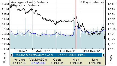
On this chart volume is represented by blue bars that are drawn out by a blue line (Volume Moving Average). The black line represents price movement during the period of time. The volume and price are put on the same chart to make it easier to understand the volume/price relationship - how one affects other.
The red vertical and gray horizontal navigation bars will help you to trace this relationship over a timeframe. To see a more detailed explanation of all features of our JavaVolume™ charts you can refer to our "Chart Help".
MarketVolume’s real time volume indicators remove the emotional factor from trading decisions. Rather than making decisions based on hope and fear, traders can keep in step with the market by following the force that moves the market: trading volume.
This is an indicator used in charts and technical analysis. It refers to the average volume of a security, commodity or index constructed in a period as short as a few minutes or as long as several years and shows trends for the latest interval. As each new variable is included in calculating the average, the last variable of the series is deleted.
This has to be one of the most important tools for our indicators. This is where you select the moving average period to apply to the volume. Normally, volume can be somewhat turbulent and you may see spikes here and there due to some large trades. With the volume moving average (VMA) you can smooth out those fluctuations so you can see where the general direction of the volume is going (i.e. increasing or decreasing).
Generally, when an index decreases and a volume moving average increases at the same time, you can expect a reversal in the index at the point the VMA spike peaks and begins to decrease again. The same is true for when an index is increasing.
MarketVolume™ has created volume moving averages (VMA) ranging from periods of 5-minutes to 60-days, for all of its indicators. These VMAs are used to smooth out volume spikes so that you can see volume as a trend and not just random spikes.
Below is a list of recommended VMA settings for every period in our charts. We recommend the following VMA settings because they tend to work the best in showing signals of future market trends.
|
Period |
Recommended VMA |
|
2 Hours |
5-minute, 15-minute |
|
1-day |
15-minute, 30 min, 60 min |
|
5 days |
30 min, 60 min, 120 min |
|
15 days |
120 min, 180 min, 1-day |
|
30 Days |
180 min, 1-day |
|
60 Days |
1-day, 2-days |
|
6 months |
2-days, 3-days, 5 days |
|
1-year |
3-days, 5 days |
|
2 Years |
5 days, 10 days |
|
5 Years |
10 days, 30 days |
Be careful! You should not set the volume moving average too high or too low, as you will either smooth out the volume too much or make it too erratic. For example, on a 5-day chart, a 60-minute VMA works best, and for a 1-day chart, a 30-minute VMA works well.
On the charts below you can see a view of charts with different VMA settings for the NASDAQ Exchange.
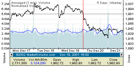
NASDAQ, 12/17/2001 - 12/21/2001, Chart without VMA.
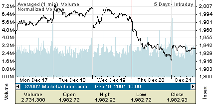
As you can see, it's difficult to recognize signals on the above chart without a VMA. Yes, if you have more then 20 years U.S. markets experience it would be enough, but it's much easier if you have a VMA:
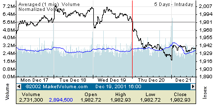
NASDAQ, 12/17/2001 - 12/21/2001, Chart VMA - 30 min.
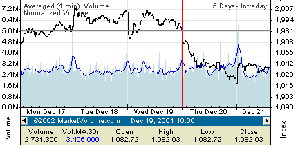
Now that you can see all movement of the volume during this period of time, you can see the market sentiment. Using navigation lines you can tie price and volume and get a clear picture of their relationship.
If you want to see the most important movements of the volume all you have to do is just increase the VMA period:
NASDAQ, 12/17/2001 - 12/21/2001, Chart VMA - 60 min.
The same Exchange, the same chart, but the VMA is different and turning-point volume signals become more clear. You can go even further and make the period of VMA 120 minutes:
NASDAQ, 12/17/2001 - 12/21/2001, Chart VMA - 120 min.
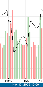
Below we have an example of multiple volume spikes, some occurring to the downside (in red) and some to the upside . A VMA spike to the downside caused the index to go up, and a VMA spike to the upside causes the index to go down.
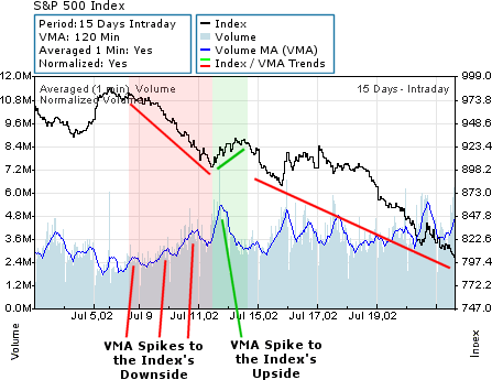
Above there were 3 VMA spikes to the downside that caused the index to begin to move up, but then there was a VMA spike to the upside that caused the index to move down again.
Why did the single VMA
spike to the upside cause the index to move down when there were 3 VMA spikes
to the downside?
That's
because the VMA spike to the upside was MUCH larger than the VMA spikes to the
downside.
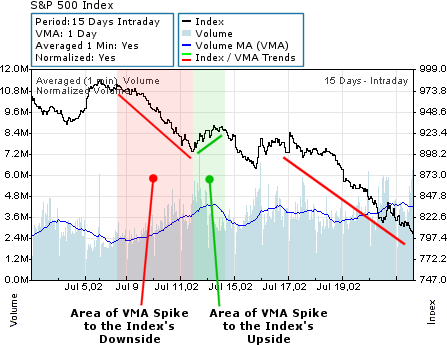
When we change the VMA period to a 15-Day VMA, it becomes more difficult to see the VMA spikes. But in general the same principal still works. The VMA increase (spike) to the downside (in red) causes the index to go up, and the VMA spike (increase) to the upside (in green) causes the index to go down.
When analyzing volume, it is very important to know the price trend during specific time frames. The market price cannot be easily analyzed without volume. Likewise, volume cannot be easily analyzed without price. Only by analyzing each factor that affects market trend can you get a clear picture about the current market situation in real time.
Below you can see some close-ups of charts with different settings for up/down volume:
|
up/down volume - off |
up/down volume - on |
|
up/down volume - on |
|
When there is a red volume bar, it simply means that the close price for the index was LOWER than the previous close price. Conversely, when the volume bar is green, it means that the close price for that period was HIGHER than the previous close price.
Generally, when there are numerous red volume bars (volume that occurs as the index is moving down) small investors are selling, and large institutional investors are buying up the shares that small investors are selling. Once volume of this nature has peaked, the index generally begins to reverse and move up again. Likewise, when the index is moving up and the volume bars are green, that means that institutional investors have begun to sell their shares. It is generally the small investors who end up buying them, as they are hopeful the market will continue to move higher.
In volume analysis, the VMA spike acts as a signal for a change in the index. By using the up/down volume charting feature, you can easily see what part of the VMA spike is to the upside and what part is to the downside. Basically, the more red volume bars you see, and the higher the red bars are, the more likely it is for the market to reverse its direction and move up. This is conversely true for green volume bars.
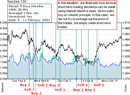
(They are looking for VMA spikes on a declining index)
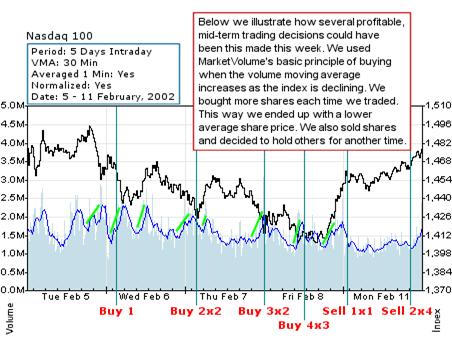
In the past week(as shown in the figure above) there have been many points at which there was a large increase in the VMA, but the index did not substantially change direction. This is the formation of what we call 'concurrent volume signals' where the buildup of large amounts of supporting volume are signaling the formation of a longer term support level for the index. In this situation it is most always profitable to buy on the spikes of the VMA and average out the price of your contracts in anticipation of the market's upcoming reversal
On each new volume moving average (VMA) spike you should increased the quantity of contracts in order to lower the average purchase price of all the contracts.
Players who purchased long-position contracts at any point where the index was declining and there was a large spike in the VMA are now in a profitable position.
You may ask who was able to predict the lowest points in this example. These are the institutional investors who know where a great many stop-loss orders were placed, and if they drove the index to that point they would be able to purchase those shares from the people whose stop-loss orders were executed. Some of these people were forced to sell their positions at this point because they were under the pressure of their margin accounts
A lot of professional investors generally have more than one chart opened for different periods and indicators simultaneously. Having more than one chart and indicator open at one time can help you see patterns in the market with greater clarity.
You can open new Java Chart by doing any of the following:
This way you can open the same indicator several times and set different periods and volume moving averages for each chart.
You may ask why you should do this. When you have several different charts open you will get a better picture of what's happening on the market. Sometimes by simply looking at a 1-day chart you can lose the picture of the market, as what happened yesterday or the day before can greatly affect what's going on today. That’s why it’s very important to have a look at several different periods, especially the 5-day and 15-day views if you are looking to place short and mid-term trades. By looking at 15-day-and-up periods, you can see the general market trend and major support and resistance levels of the market. By combining all this information you can create a successful trading strategy.
For example, below we have a 5-days chart of the NASDAQ 100. You can see the rise in activity for the market during the period of January 22-23, 2002:
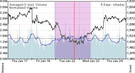
From this chart you can see that the direction of the index changed during an increase in the volume moving average (VMA) Some people may ask whether the index will continue this uptrend, or will it die off and continue going back down. The key to answering this question is to know whether the volume associated with the index’s move upwards was large enough to make this move permanent. We call this critical volume.
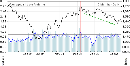
If you were to take a look at the 6-month chart for the same indicator (NASDAQ 100) you will see that the volume associated with the above change in direction was not critical. The volume spike above did not approach the level of the volume that caused the index to be in a downward trend to begin with on December 6th. Therefore this volume was NOT critical, and the index should continue its downward trend.
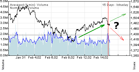
Now, according to what we have said above, what do you think about the peak of volume that occurred on February 14th, 2002, from 13:00 to 16:00? Is it a critical volume signal that shows the market is going to continue up (as it occurred on a down market), or is it not critical and the market will go down?
We want to help you better understand the importance of volume signals in trading, and we hope that our few starting points will help you to make your own analysis and make successful trading decisions.
 |  |  |