![]() |
![]() |
![]() |
![]() |
![]() |
![]() |
![]() |
![]() |
![]() |
![]() |
![]() |
![]() |
![]() |
![]() |
![]() |
![]() |
![]() |
![]() |
![]() |
![]() |
![]() |
![]() |
![]() |
![]() |
![]() |
![]() |
![]() |
![]() |
![]() |
||||||||||||||
![]() |
||||||||||||||||||||||||||||||||||||||||||
![]() |
||||||||||||||||||||||||||||||||||||||||||
Copyright (c) B.Achutha 1992 - 2000 Malaysia |
||||||||||||||||||||||||||||||||||||||||||
![]() |
||||||||||||||||||||||||||||||||||||||||||
Population vs Price |
||||||||||||||||||||||||||||||||||||||||||
An alternative method of drawing the distribution of Wealth graph is by plotting Population vs Price. This is especially significant for the manufacturers. |
||||||||||||||||||||||||||||||||||||||||||
![]() |
||||||||||||||||||||||||||||||||||||||||||
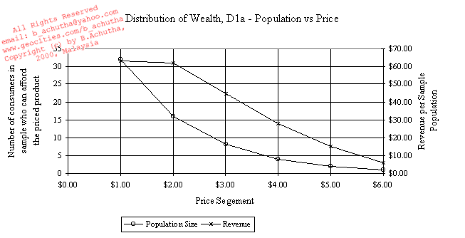
Graph D1a shows that revenue peaks when the product is priced below $2. Where as Graph D2a shows that revenue peaks when the product is priced under $3. Revenue being defined as the price of the product multiplied by the total fraction of the population that can pay and mulitpied by the population sample size. |
||||||||||||||||||||||||||||||||||||||||||
![]() |
||||||||||||||||||||||||||||||||||||||||||
|