| Chart types |
Lets go through several chart types commonly used in technical analysis. Chart types described here are line chart, bar chart, candle chart, and point & figure chart.
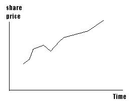
Line chart is drawn by joining closing price of commodity across time.
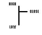
At each interval of your chart, below symbol is drawn which shows interval high, low
and closing price.
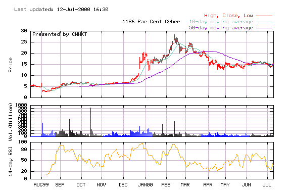
Completing the whole chart we have something like this...
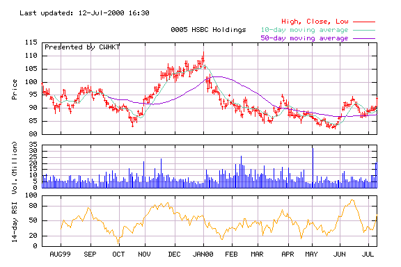
This chart is download from Netvigator
financial news site. It also includes 10 day moving average, 50 day moving average,
volume and 14 day interval RSI. Those will be discussed one by one. Let focusing on chart
type for the moment.
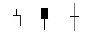
The symbol used in each interval like a candle. Illustration below shows how to draw
and what their meanings are.
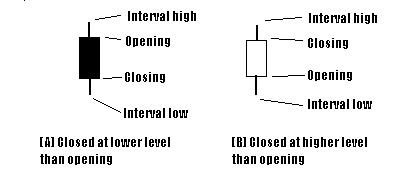
Note that (A) is in a falling situation in a interval while (B) is in a rising price
situation. There are several possible figures. Their meanings are obvious, take a look.
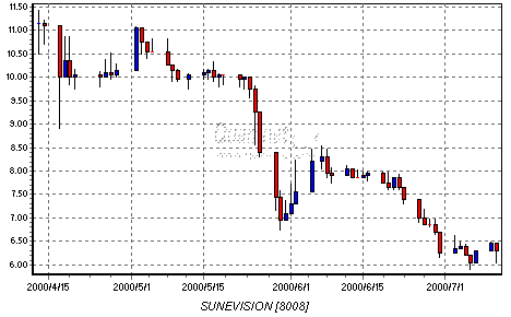
And a comprehensive illustration downloaded from Quamnet.
It used blue when commodity rises, red when falls.
Not difficult, right? We now combine volume into our charts.
Volume
Volume is plotted by vertical line on an interval underneath the chart. On below graph,
it is represented by blue vertical lines in each trading days. (scaled in million)
As you can remember, Dow Theory stated that trends must be confirmed by volume. Volume
analysis is very important. When I am very fresh in stockmarket, I choose an excellent
covered warrant by a lots of calculations but ignore volume. It turned out with no trade
for several months when I tried to sell. Finally there was a transaction at a price
dropped 80% since last traded.
Time Frame of chart
You are free to choose the time interval of your charts such as daily, monthly, or even yearly. It is obviously no point to use monthly chart if your investment period is around 2 weeks. When you want a macro view across long period of time, daily chart would present too much distracting details.
This type is easy to plot and useful for short term speculation. X represents increased
one unit of price, O represents decreased one unit. Everytime it changed direction, start
a new line. You may use any amount as the unit. If the unit is too tiny, the message
presented on the chart will be distracting and you will be very busy drawing X and O.
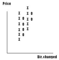
Direction changed three times in the chart and now is falling by 2 units from the height.
Home | Technical
| Fundamental | Links | Bookshelf
Egghead Investor Guide