Making Curved Text
This
next bit can be a bit tricky so take your
time and don't fret if everything starts
going wrong... just keep hitting undo
until you get it how you like it.
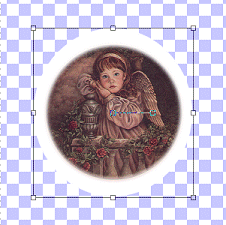
Click
and drag a circle around your image,
making sure that your circle is a little
bit bigger than your image. When you
are happy with the rough size of it (you
don't need to be exact), release the mouse
button.
Yes, I
know your image has disappeared.
Don't worry, it's hidden away safely :o)
Now we
need to try and give your image an edge
using the white shape. Don't
worry... there *is* a method to my
madness... I know this is a text tutorial
and we haven't done anything with text
yet... we just need to do a bit of
preparation first :o)
Okey
dokes, so how do we get the edge around
our image when we can't see our image?
You go to "Layers" then down to "Arrange"
and across to "Send To Bottom"

You'll
notice that those little square boxes are
still around your white shape?
That's cool - we want it like that :o)
This
is where it might start getting tricky, so
save your work again just in case :o)
Hover
your mouse over one of the little boxes on
the side... you'll notice that your cursor
changes to a double-headed arrow shape -
the arrow heads are pointing to both the
left and the right and a little rectangle
shape is above it.
Now
hover over one of the boxes at either the
top or the bottom... you'll notice that
your cursor changes to a different sort of
double-headed arrow - this time the arrow
heads point up and down and the little
rectangle is still there.
Try
hovering over one of the corner boxes now.
Your cursor has changed to a 4 headed
arrow with the little rectangle still
there.
Decide
what how much space you want to leave
around the outside of your image... the
space that is showing in white will be the
gap between your picture and your text -
any letters that have a tail (lower case
g, y, j, p, q etc) will hang into the
white - the main part of the text will go
around the top of your white shape.
I usually leave somewhere between half and
a whole square of the background in white
depending on how fancy my text is going to
be - if it's going to be really swirly and
elegant I leave about a square but if it's
something plain I usually leave about half
a square of background.
The
best way to work out how much space you
need is to try and "see" the text on your
white shape... try and see all the letters
and what they look like - how far down
does the tail of that letter come?
When
you've decided how much space you are
going to leave around the outside of your
image, you need to click and drag on those
little square boxes to get your white
shape and your image to be roughly the
same shape but leaving your little half to
1 square white edge around the outside of
your image - use the surrounding
background squares as a guide to how much
you are taking your white shape in by.
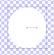
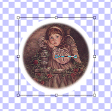
This
is what mine looks like now:
Save
your work... that's the hardest bit done!
:o)