(last updated: Sep 11, 2008)

Paleoclimate is the study of the climate of the past. This enables us to understand present climate change with the perspective of what has happened before. This page examines the history of climate starting from the present time, and moving towards longer time periods in the more distant past. In general, we are presently in a relatively cold period. For most of the past it has been considerably warmer with little or no polar ice, with carbon dioxide levels also higher than today. From this perspective, the magnitude of any human-caused changes to the climate up until now appear to be small compared to what the Earth has already experienced. The present rate of change, if it continues, is much higher than anything experienced in the past.

Site Map

Time periods:  25 yr,  150 yr,  1,000 yr,  12,000 yr,  100 Kyr,  650 Kyr,   5.5 Myr,   65 Myr,  500 Myr
A Global Warming Case Study: The Paleocene Eocene Thermal Maximum
The Eemian Interglacial - Lessons for Today?
Milankovitch Cycles and the Ice Ages
Rapid Global Cooling: The Younger Dryas Event
Projections for the 21st Century

Li nk to my Blog for feedback Post Comments on my Blog


Local Weather and Global Climate

Weather is measured over the course of a day, a week, or even a year. Climate is the average of the weather that occurs over decades or longer. A common mistake is to confuse a short term trend in the weather with a change in climate. For example, the chart below is the annual average temperature for the province of Quebec. This can vary by a degree or two each year, and there are periods of a couple of years when the temperature is relatively high or low. The change in the long term climate is shown by the blue line. The climate is gradually getting warmer, but only by 0.06 degrees Celsius per decade, which is far smaller than the annual variation. The average temperature can vary more in a year than the climate did in an entire century. But over a long period of time a slow but steady rate of warming will become significant.

AnnualWeatherChart This chart was generated from the interactive NOAA Satellite and Information Service website.

A typical prediction for the impact of global warming is a rise in temperature of 3° C by the end of the 21st century. This figure is not only an average over time, it is also an average over the entire surface of the Earth, including the oceans. Different regions will experience different amounts of warming, so some regions will experience more warming than the global average. The map below (on the left) shows the annual average temperature for the world at the present time, with each colour representing a difference of 5° C. A first approximation of the impact of five degrees of warming would be to increase the temperature of each colour zone by five degrees. Or another way to look at it is your future climate will be much like the present climate in the next colour to the south. In reality, a changing climate affects wind and ocean currents, which means the actual changes will be more complex.

The middle graph shows there is a temperature gradient of 1° C per 145 km. If 3° C of warming is expected in the next 100 years, then each temperature band is advancing northward (in the northern hemisphere) by 3 km per year, on average.

The map on the far right shows the average annual insolation, with each band representing 20 watts per square meter. These bands are roughly equivalent to the 5° bands on the left image. Insolation increases more near the equator than temperature, reflecting the fact that the main driver of weather is the transfer of heat from the topics toward the poles.

Global temperature map
Temperature_versus_Latitude
Temperature_versus_Elevation
Solar Insolation in Watts per Square Meter

Solar_Insolation_Global.png
Source for first three images: Global Warming Art


The last 25 Years - Steady Global Warming

This chart shows the global average temperature for the past quarter century. On the monthly or yearly scale it is more a measure of weather rather than climate. Whereas on a local scale the annual temperature (averaged over the year) can vary by a degree or two, we can see that on a global scale it only changes by about 0.2 degrees. Temperature peaks tend to correspond to El Nino years, except when there is a major volcaono. The five year average is beginning to detect climate change, showing a steady upward trend. This graph and the one below show that temperatures are increasing linearly (at 0.17° C per decade) rather than exponentially, at least for now.
Short_Instrumental_Temperature_Record Source: Global Warming Art


The chart below (generated from this NASA site) illustrates the global distribution of warming between 1970 and 2000. A ten year interval around the start and end dates was used to smooth out annual variations. Observe that most of the warming occurs in the northern hemisphere, especially in the Arctic. The oceans, covering most of the planet, only warmed by 0.35° C, while at 45° N (where most people live) warmed by 0.7° C and the high Arctic warmed by 1.2 degrees.

Anomaly_Annual_1965-1975_to_1995-2005.jpeg


150 Years - The Industrial Era

The following two charts show the trends in global air temperature for the last 150 years, covering the period of industrialization. On the temperature chart three trends are apparent. In the first half of the century temperatures rose significantly, even though anthropogenic greenhouse gas levels were relatively low. In the middle period, between 1940 and 1970 temperatures dropped slightly even though greenhouse gas levels continued to rise. There has been a steady temperature increase since 1970, for which the only explanation is increased greenhouse gases. Overall there has been 0.6° C to 0.8° C of warming. [ref]

The lower chart shows the distribution of the temperature changes for the past century. The vertical axis represents the average temperature for each latitude. One can see that the warming in the 1930's was not really global, it was a regional warming in the Arctic with global consequences. The 1940-1970 cooling can be seen as a return to the normal climate. This pattern contrasts with the warming after 1980, which is much more global in scope.

Although the mid century cooling appears to be a notable feature of the temperature chart, the real question is the cause of the warming in the early part of the century. Reduce that warming, and the apparent cooling disappears. Greenhouse gas emissions were relatively low, and counter balanced by increasing aerosol pollution, which causes the reflection of incoming sunlight. The warming has been attributed to increased solar insolation, but why did temperature rise most in the one region (the Arctic) where it shines the least? The explanation may be a regional climate fluctuation largely unrelated to anthropogenic influences.

According to the 2007 IPCC report [AR4 WG1 Ch03 3.2.2.3], the peak warmth in the early 1940s is likely to have arisen partly from closely spaced multiple El Niño events, and also due to the warm phase of the Atlantic Multi-decadal Oscillation (AMO). The prolonged 1939–1942 El Niño shows up as a warm interval. In the Atlantic, the warming from the 1920s to about 1940 in the NH was focussed on higher latitudes, with the SH remaining cool. The recent strong warming appears to be related in part to the AMO in addition to a human caused global warming signal.  There were also major volcanic eruptions in 1951 and 1963, corresponding to the downward temperature spikes on the graph.

temperature and rainfall Annual anomalies of global land-surface air temperature (°C), 1850 to 2005, relative to the 1961 to 1990 mean for CRUTEM3 updated from Brohan et al. (2006). The smooth curves show decadal variations. The black curve from CRUTEM3 is compared with those from NCDC (Smith and Reynolds, 2005; blue), GISS (Hansen et al., 2001; red) and Lugina et al. (2005; green).

From IPCC 2007 WG1 Ch3


Because warmer air can hold more water vapor, one effect of global warming is increased precipitation levels. The following chart show that is indeed the case for the warming during the 20th century. The only major region with less rainfall was central Africa. But note that warmer temperatures also increase evaporation, so the net effect of increased moisture may be less than it appears on this chart.

nnual_Precipitation_Trends_1900_2000.PNG


1,000 Years - Warming and Cooling

The chart below shows temperatures for the last thousand years, from left to right. There are no accurate records from instruments for this time period, so temperatures must be calculated using indirect evidence. For example, the width of tree rings can tell us what the climate was like while the tree was growing. Several reconstructions are shown in this graph, which differ from each other but follow the same pattern. After the "Medieval Warm Period" of 1000 years ago, the world entered the "Little Ice Age", followed by a rise in temperatures in the 20'th century [ref]. Below it is a chart of the solar cycle for the past 1,100 years, based on Carbon-14 isotope measurements. The varying temperatue of the sun is probably one of the causes of climate change during this time. But note that the Medieveal Warm period identified on the temperature chart lags that in the solar chart by a century. We can see that the present period of global warming coincides with a high point in the solar cycle. There may have been some solar impact on the warming in the first half of the 20th century, but there has been no significant change in solar radiation in the second half when the human caused global warming signal becomes apparent.

Temperature Chart for the last 1000 Years 2008 Reconstruction of the last 1000 years based on multiple proxies, from this RealClimate article.
SolarCycleFor1100Years_Carbon14 Solar cycle based on Carbon-14 isotope measurements.


12,000 Years - Recovery from the Ice Age

This graph covers part of the current (Holocene) interglacial period, which includes all of human civilization. Following the sudden end of the Younger Dryas (a short period of intense cooling), the Arctic entered several thousand years of conditions that were warmer and probably moister than today. This early Holocene warm period appears to have been punctuated by a severe cold and dry phase about 8200 years ago, which lasted for less than a century, as recorded in the central Greenland ice cores. Eight different estimates are shown, indicating a lot of uncertainty, but agreement on the general pattern. Recently tempertures have risen rapidly, but are still within the same range as the recent past. However, it global temeratures continue to rise at the rate experienced in the past few decades, temperatures could exceed any experienced during the Holocene interglacial.

The unusual stability of the Earth’s climate during the Holocene probably is due to the fact that the Earth has been warm enough to keep ice sheets off North America and Asia, but not warm enough to cause disintegration of the Greenland or Antarctic ice sheets. [ref]

Holocene_Temperature_Variations
Records of NH temperature variation during the last 1.3 kyr. (c) Overlap of the published multi-decadal time scale uncertainty ranges of all temperature reconstructions identified in Table 6.1 (except for RMO..2005 and PS2004), with temperatures within ±1 standard error (SE) of a reconstruction ‘scoring’ 10%, and regions within the 5 to 95% range ‘scoring’ 5% (the maximum 100% is obtained only for temperatures that fall within ±1 SE of all 10 reconstructions). The HadCRUT2v instrumental temperature record is shown in black. All series have been smoothed with a Gaussian-weighted filter to remove fluctuations on time scales less than 30 years; smoothed values are obtained up to both ends of each record by extending the records with the mean of the adjacent existing values. All temperatures represent anomalies (°C) from the 1961 to 1990 mean. From IPCC 2007 WG1, ch 6.

The chart below shows average annual temperatures in Greenland, using data from an ice core.  The temperature varies by more than three degrees during this period, with the present time at the low end.
GISP_to_11Kybp.gif

These three maps of Africa below illustrate how changing temperature affects rainfall and vegetation patterns. The map on the left is Africa of today. The middle map is Africa at the peak of the last ice age, about 20,000 years ago. The cooler climate resulted in an expansion of the Sahara desert, and the tropical rainforest almost disappeared. The map on the right is during the Holocene climatic optimum, which was warmer than today. The Sahara desert is almost gone, covered by grassland, and the tropical rainforest is much larger. This illustrates the general principle that a warmer climate is a wetter climate. However, there is another factor that influenced precipitation in Africa 7,500 years ago.

The Earth's orbit is elliptical, causing it to be closer to the Sun for half of its orbit. Today, that occurs during northern winter, causing relatively milder winters and cooler summers. But due the the precession cycle the Earth was closer to the sun during northern summer 7,500 years ago. This difference affected the pattern of monsoon winds that bring moisture to subtropical regions such as the Sahara [ref]. Therefore it may not be accurate to assume global warming will produce the same rainfall pattern. See also this information about the changing climate of Africa during this time period.

AfricaClimateZones.PNG


100,000 Years - One Ice Age Cycle

The chart below shows the temperature for the last hundred thousand years, covering the last ice age, as measured from an ice core in Greenland. During the ice age, the global average temperature was five or six degrees Celsius colder than today. Half of North America, including all of Canada, was covered by an ice cap up to 3 kilometers thick, as was a large part of Europe and Russia. In general, ice ages have lasted about one hundreed years, followed by a warmer interglacial period lasting about ten or twenty thousand years. We are presently in the middle of an interglacial period.

LastGlacialMaximum

A series of rapid warm and cold oscillations, called Dansgaard–Oeschger events, punctuated the last glaciation, often taking Greenland and northwestern Europe from a full-glacial climate to conditions about as warm as at present. Temperature changes of up to 16º C can take place in few decades. These interstadials lasted for varying periods of time, usually a few centuries to about 2000 years, before equally rapid cooling (associated with large amounts of glacial ice discharged into the ocean) returned conditions to their previous state. Heinrich events are series of sudden, brief cold events that seem to have occurred very frequently over the past 115 000 years, during times of decreasing sea surface temperatures in the form of brief, exceptionally large discharges of icebergs in the North Atlantic from the Laurentide and European Ice Sheets. It is believed that the ice caused the North Atlantic current to slow down or stop, leading to the sudden cooling.

A few thousand years after the apparent recovery from the ice age (the Bølling-Ållerød warming), the Arctic was suddenly (in less than 100 years) plunged back into a new and short-lived cold event known as the Younger Dryas. This lasted for 1300 years, and ended very abruptly with central Greenland temperatures increasing by 7 ºC or more in a few decades. This was followed by the much more stable interglacial period known as the Holocene, which we are presently still in.

Each cycle begins with a warming event, which causes the ice to retreat, leading to less reflection of sunlight and further warming. Ice caps may grow larger because the warming bring increased snowfall in winter which may exceed the extra melting in summer. At some point there is an ice cap collapse, which sends large amounts of icebergs into the ocean. These directly reflect sunlight, but more importantly they weaken the North Atlantic current that brings the warmth.  A reverse cycle of increased ice cover and lower temperatures then sets in.

The Greenland data has been extended back in time to cover the Eemian interglacial by substituting date from Antarctica. This is not entirely valid, as the Milankovitch forcings in the southern hemisphere lag behind those in the northern hemisphere by 10,000 years. The chart at the bottom shows seasonal temperature anomolies at the latitude of  70º North, which are a result of the Milankovitch Cycles.  It can be seen that periods of relatively warm temperatures correspond with strong springtime warming.

Greenland Temperature Chart


650,000 Years - Multiple Ice Ages

The charts below are based on detailed information obtained from two deep ice cores from Antarctica, which includes ice that is up to 650,000 years old. Temperatures and carbon dioxide levels can be detected from pockets of air trapped in the ice, and a year by year record can be produced.  We can see the ice age cycle of about 100,000 years of cold followed by about ten thousand years of relatively warm interglacial, which we are in now (year zero). Note that the present interglacial period is not quite as warm as those before it, but is not decending back into the glacial stage as quickly.  Carbon dioxide levels closely track but slightly lag behind temperatures. Carbon dioxide is released from the ocean as temperatures rise, so it behaves as a positive feedback to the orbital forcing that drives the climate.

Observe in the top chart that the amplitude of the cycles is smaller before 400,000 years ago, conforming the the pattern of intensifying cycles shown above.

Note that carbon dioxide levels vary from 180 ppm (parts per million) during ice ages to 300 ppm during interglacial periods. This 120 ppm increase takes on the order of 10,000 years, while today we have increased carbon dioxide levels by 100 ppm in 100 years, a rate one hundred times as fast.
650,000 Years Antarctica Ice Corehttp://www.realclimate.org/index.php?p=221#more-221
Vostok Ice Core
The chart in the bottom corner shows solar insolation amounts caused by Milankovitch Cycles at latitude 80º S over the course of a year. Note that the temperature peaks on the graph correspond to the warm periods during the southern spring.


5,500,000 Years - A Descent into 'Chaos'

Here is more detail on the final descent into the current ice age from the warmer and more stable climate of three million years ago. Average temperature is falling, and climate fluctuation is becoming more intense. This period covers the evolution of humans from their common ancestor with chimpanzees. Before a million years ago there was a 41,000 year cycle between extreme ice age conditions and a shorter interglacial thaw. Since then there has been a more intense 100,000 year cycle. The 41.000 year cycle is still present, but the declining average temperature began to prevent a return to interglacial conditions. See the discussion on Milankovitch Cycles for the significance of these cycle times.

5 million years
Source: Global Warming Art

The Pliocene epoch lasted from 6 to 1.8 million years ago, spanning the right half of the graph above. The table below compares global vegetation today with the mid-Pliocene (about 3 million years ago), when the global average temperature was 3° C warmer than today. The CO2 amount ~3 My ago has been estimated as 380-425 ppm (Raymo et al. 1996) [ref]. Some climate models predict that much warming by the end of the 21st century. Observe that there is no Arctic sea ice in summer, only the central part of Greenland has an ice cap, and that desert regions are smaller than today. A warmer climate is usually a wetter climate, but it is not entirely valid to assume the present global warming will lead to the same result, at least not right away. The paleoclimate data is averaged over a long period of time from a climate in equlibrium, while the near future will be a climate in transition. There are several reasons while it may take some time to reach equilibrium rainfall levels

PlioceneAndModernVegetation.jpeg


65,000,000 Years - The Age of Mammals

The chart below illustrates how in the past 65 million years (the age of mammals after the mass extinction which included the dinosaurs), global temperatures have gradually fallen, and become more unstable. Click here  to see how the world looked at the time. The Arctic Ocean has been permanently frozen only for the past 3 million years. Note that the older, warmer temperatures can be estimated because there was no permanent ice, and the recent termperatures can be calculated because we have geological means to estimate the size of the ice caps. The section in the middle is more uncertain. The spike labeled PETM on the right side of the graph (55 million years ago) is a period of rapid global warming known as the Paleocene Eocene Thermal Maximum, described in more detail below.

65_Myr_Climate_Change
Source: Global Warming Art


500,000,000 Years - The Era of Complex Life
The graph below shows temperatures for last half billion years, starting on the right with the Cambrian period and ending at the present time on the left. (Unfortunately, different graphs go in different directions.)  This is the time period for which there has been animal life in the oceans and (most of it) plants on land, so the ecology is roughly equivalent to today. Observe that climate is constantly changing, and that we have entered one of the coldest glacial periods.

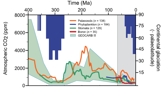
How we can Calculate Temperatures for the Deep Past

There are no direct measurements of temperature in the past, so scientists must reconstruct them from indirect evidence (or "proxies"). In this case the ratio of isotopes of oxygen found in the shells of  fossil microscopic sea animals (benthic foraminifera) are used [ref].

The element oxygen occurs mainly as two isotopes: the common isotope 16O (99.765%), and the heavier rare isotope 18O (0.1995%). When ocean water (H2O) evaporates, the lighter 16O escapes more easily than the 18O, resulting in a higher concentration of 18O. When the water is warmer, the molecules are moving faster, so the difference is less. Therefore colder water retains relatively more d18O than warmer water. The foraminifera incorporate that oxygen into their shells, which accumulate on the ocean floor after they die. We can estimate the water temperature by the ratio of 18O / 16O (referred to as d18O) in these fossil shells.

When water condenses from the atmosphere as rain or snow, the precipitation has a higher
d18O, because the heavier molecule condenses more easily. Rain that falls inland is more depleted in 18O than rain in coastal areas, because some of it evaporated from the land surface, where it was already isotopically depletedThis effect is strongest in Antactica. The present ice sheets are thus strongly depleted in 18O as compared to ocean water.  Bigger ice sheets mean higher d18O in the ocean. This conflicts with fact that colder water also has a higher d18O. So when there are ice caps, we cannot calculate the water temperature from d18O unless we also know the volume of ice.

Source: Global Warming Art
Phanerozoic_Climate_Change
Paleomap
Timeline Timeline Timeline Timeline Timeline Timeline Timeline Timeline
Click on these symbols to view a map of the Earth for that period, or its place on the evolutionary timeline.


This graph presents several estimates of carbon dioxide levels for the same time period as above, and show major glaciations that occured. Generally they correspond with temperature (see the Greenhouse Effect). For most of this time period carbon dioxide levels have been far higher that those of today, or any that are likely to occur in the near future because of industrialization. However, we cannot detect how rapidly carbon dioxide levels changed in the past. See the Global Carbon Cycle for more information on the role of carbon dioxide.

Carbon Dioxide over 500 Million Years Atmospheric CO2 and continental glaciation 400 Ma to present. Vertical blue bars mark the timing and palaeolatitudinal extent of ice sheets (after Crowley, 1998). Plotted CO2 records represent five-point running averages from each of the four major proxies (see Royer, 2006 for details of compilation). Also plotted are the plausible ranges of CO2 from the geochemical carbon cycle model GEOCARB III (Berner and Kothavala, 2001). All data have been adjusted to the Gradstein et al. (2004) time scale. From IPCC 2007, WG1, Ch 6.

For details on the early Permian glaciation (265 to 305 Mya), see [Science Sep 07]. See also the Evolution Timeline for the relationship of carbon dioxide and mass extinctions.


  The graph below show that oxygen levels tend to be high when carbon dioxide levels are low.
Phanerozoic_Oxygen.gif The atmospheric O2 curve is taken from (23). The upper and lower boundaries are estimates of error in modeling atmospheric O2 concentration. The numbered intervals denote important evolutionary events that may be linked to changes in O2 concentration (see text in Science 2007 Apr 27)


A Global Warming Case Study: The Paleocene Eocene Thermal Maximum

The Paleocene Eocene Thermal Maximum was a period of rapid global warming that occured 55 million years ago. At the time, the global average temperature was about 5° C warmer than today, and there were no polar ice caps. A large amount of carbon dioxide entered the atmosphere in a geologically short amount of time, and the global average temperature rose by another 5° C. This warming event lasted about 170,000 years. It appears that 2000 to 4000 gigatonnes (Gt) of carbon was added to the atmosphere in a period of 10,000 to 20,000 years, during which surface temperatures rose by up to 8° C.

Estimates of how much warming occured:
Estimates of how much carbon entered the atmosphere: The effect on the ocean: Effects on Biology:
Was it caused by a massive methane release?

But maybe it was not caused by methane:
How can we tell it happened?

This was accompanied by an exceptionally large change to the global carbon cycle as indicated by a large drop in the isotopic ratio of 13C to 12C in the ocean and on land. The ratio of these carbon isotopes generally changes as a function of biological activity, since carbon in living matter tends to be preferentially made up of 12C as opposed to 13C. Thus an increase in biological activity "uses up" more 12C, and therefore the ratio of 13C to 12C in the remaining carbon increases. Conversely, a decrease of biological uptake, leads to a decrease of the isotopic ratio (i.e., it gets "lighter"). The change at the PETM was so large that it would have required a decrease in biological activity equivalent to roughly three times the total present-day terrestrial biosphere. In other words, if all of the terrestrial carbon today (in forests, animals, soils, etc.) were converted to carbon dioxide and returned to the global inorganic carbon pool, the change in the global carbon isotopic ratio would only be a third as big as that observed during the PETM.

After the PETM: "pCO2 ranged between 1000 to 1500 parts per million by volume in the middle to late Eocene, then decreased in several steps during the Oligocene, and reached modern levels by the latest Oligocene. The fall in pCO2 likely allowed for a critical expansion of ice sheets on Antarctica and promoted conditions that forced the onset of terrestrial C4 photosynthesis." [Science July 2005]

See the Paleocene-Eocene Thermal Maximum in context on the Evolutionary Timeline


The Eemian Interglacial - Lessons for Today?

The climate of the last interglacial (LIG) period, from 129,000 to 118,000 years ago (1, 2), was slightly warmer than today's and is often viewed as an analog of the climate expected during the next few centuries. Recent assessments of the LIG climate have provided strong evidence that sea level was 4 to 6 m above the present level, due to partial melting of both Greenland and the West Antarctic Ice Sheet (WAIS) (3, 4). At peak interglacial conditions, summer temperatures were 2° to 5°C warmer than today in the North Atlantic (5) over Greenland (6) and the Arctic (7). The Norwegian-Greenland Sea experienced large variability, but during the warmest period, the Arctic oceanic front was located west of its present location (8). Consequently, the Arctic climate was warm enough to explain the shrinking of the Greenland Ice Sheet during the LIG (9). In the Southern Hemisphere, an ~
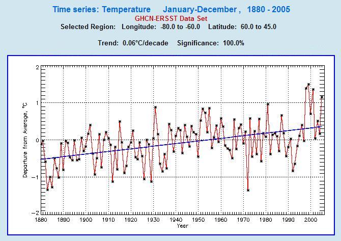
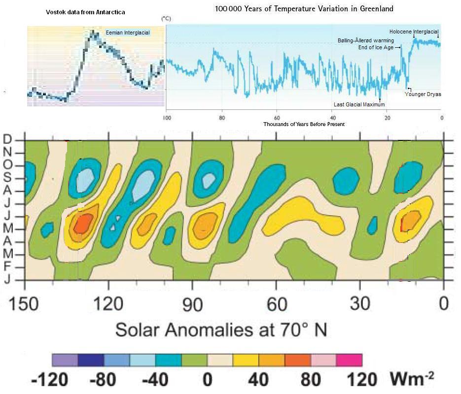
2°C warming occurred over the Antarctic Plateau during the LIG (10), but it could not have resulted in any melting because local air temperature was still extremely cold (~–50°C). In the Southern Ocean, summer sea surface temperatures were about 2°C higher than during the Holocene (11, 12). Over New Zealand and Tasmania, the LIG warming was between 0° and 2°C (13, 14). Such increases in surface water or air temperature seem too small to have resulted in substantial melting of the WAIS (15).  [Science, Apr 2007]

Eemian_ArcticTemperatureAnomolies Maximum observed LIG summer temperature anomalies relative to present derived from quantitative [terrestrial (circles) and marine (triangles)] paleotemperature proxies as part of CAPE Last Interglacial Project.


Rapid Global Cooling - The Younger Dryas Event

[coming soon...]

The Future

The chart below shows the observed global average temperature changes for the 20th century, and projected changes (using the most recent climate models) for the 21st century. Projections depend on the "emissions scenario", meaning how much greenhouse gases actually get added to the atmosphere in this century. This, of course, is not known, so several scenarios (as defined by the IPCC) are used. As for the three shown here:
See also Estimating Future Sea Level

ClimateSimulation_1900-2100_IPCC2007.JPG

The chart below, from the IPCC 2007 Summary for Policy Makers, shows the surface temperature of the Earth in 30 and 100 years from now, as determined by a set of climate models, for three emissions scenarios (described above). The graphs on the left shows the probability range for the global average temperature in these two time periods. For example, in the A1B scenario, the most likely temperature increase in 30 years is a bit less than one degree, and less than 3 degrees in 100 years.
Projections_Of_Surface_Temperatures.PNG
Projected surface temperature changes for the early and late 21st century relative to the period 1980–1999. The central and right panels show the Atmosphere-Ocean General Circulation multi-Model average projections for the B1 (top), A1B (middle) and A2 (bottom) SRES scenarios averaged over decades 2020–2029 (center) and 2090–2099 (right). The left panel shows corresponding uncertainties as the relative probabilities of estimated global average warming from several different AOGCM and EMICs studies for the same periods. Some studies present results only for a subset of the SRES scenarios, or for various model versions. Therefore the difference in the number of curves, shown in the left-hand panels, is due only to differences in the availability of results.

The chart below (also from IPCC 2007) shows the predicted change in precipitation levels in the next one hundred years, in (northern) winter and summer. There is far more uncertainty here than for temperatures. As can be seen from the caption, the "stippled" areas mean only that 90% of the models agree which way rain levels will change, not by how much. The rest of the map has even less agreement. The general pattern is increased precipitation in the temperate and polar areas, and decreased rain in sub-tropical regions.
Projected_Patterns_Of_Precipitation_Changes.PNG
Relative changes in precipitation (in percent) for the period 2090–2099, relative to 1980–1999. Values are multi-model averages based on the SRES A1B scenario for December to February (left) and June to August (right). White areas are where less than 66% of the models agree in the sign of the change and stippled areas are where more than 90% of the models agree in the sign of the change.


Comment on my Blog
See the larger context for paleoclimate on the Evolutionary Timeline.
Return to the Climate Change Main Page
 
Document made with Nvu