| BM in Love | Bleed Green? | Comic | CD | Bloopers | In-Jokes |
No. No. No no no no no no no no no no. No124. The art sucks. The art drags the comic down. As with the writing, there are a few good points and places that aren't half bad, but they're few and far between. Since there are a few components to the art, I'm going to examine each seperately. Where I'm mentioning a specific piece of art, you can view it by clicking on the thumbnail alonside the text, or by clicking on the hyperlink.
THE COVERS
 |
 |
 |
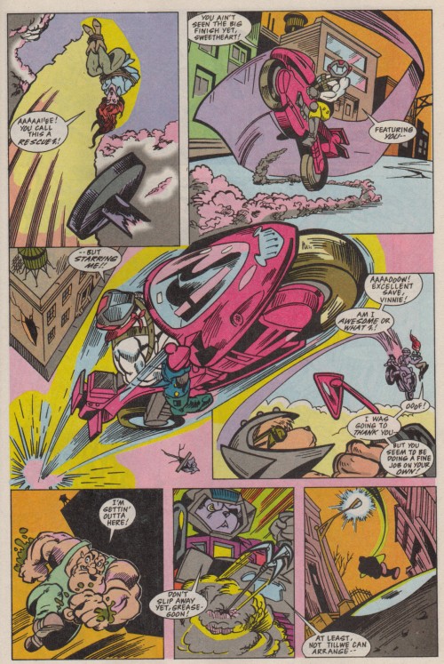
The covers are definitely the high point of the artwork. While the first uses the picture we've all seen 20,000 times before of the mice on their bikes at night in front of the Last Chance Garage, the second and third have original painted artwork by series penciler Rurik Tyler. Both are just about gorgeous, with the use of color being particularly noteworthy. The Karbunkle looming in the background of the second cover is appropriately terrifying, although Greasepit might have been more appropriate for this issue, given that the mice don't meet up with Karbunkle until #3. That, or an enlarged version of the little Martian mousetrap in the corner). On the third, I'm particularly fond of Throttle's sunglasses, which look very thick and glassy. The only problem I have with the covers is with the use of the aforementioned "picture we've all seen 20,000 times" on the first issue. Splendid jobs, every one. The only cover I have any real problem with is the first. Don't get me wrong, I like the art (even if I would've rather seen more original art instead of the same piece used over and over again). However, the style of the first cover is radically different from the interior art. If you would've picked this up at your local comics shop (or your local Silver Star Video, as I did), you'd think you were going to see Biker Mice depicted in a style closely resembling the animation, and that's not the case. So it's a little misleading.
Otherwise, though, the covers are great. I wonder if future issues would have had similar treatments, or if they would've been standard "drawn" covers. Hard to say. But maybe Tyler should've spent a little less time on the front of the books and more time on their interiors...
PENCILS
(NOTE: Without seeing the original penciled artwork, I don't feel that I can adequately comment on the inking done by Gary Fields. He may have simply "traced" Tyler's artwork to prepare it for colors and printing, or he may have had to finish pages from tight pencils, as inkers sometimes have to do when time is tight (that would explain some of the discrepancies in the art). So some of the criticisms below may be directed at the wrong man. If so, my apologies, Mr. Tyler.)
The penciler for this project was veteran illustrator Rurik Tyler, who's got a really nifty first name. Doesn't he? "Rurik." Wonder if it's real. At any rate, Tyler's past works are many and broad in scope. He's done "Darkhold," "Midnight Sons" (which featured occult Marvel Comics characters, among them Ghost Rider), "What Th'," and Cracked magazine. With such a diverse blend of deadly serious and humor under his belt, Tyler would seem to be a good choice for a Biker Mice comic. If only it were question of his background, and not of raw talent…
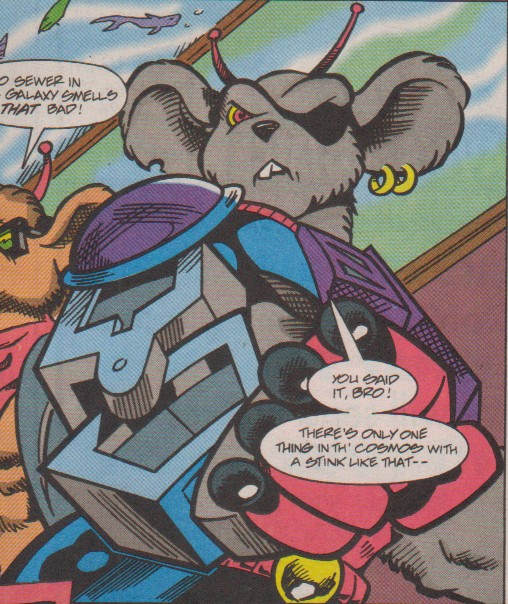
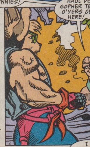
Some good news first. For the most part, designs for the animated series were carried over quite faithfully into the comic book version. The characters all basically look like we expect them to, wearing the same clothing and with the same features (colors do tend to be off, however; more on that in a minute). Neither humanoid mice nor Plutarkians seem to give Tyler too much trouble, and Limburger particularly comes across well. Only Fred the Mutant looks off, but I mean, hey, we're talking about Fred here. Tyler also draws the mice's bikes and other mechanical stuff very well. I particularly like this shot accentuating Modo's arm from issue #3. Limburger Tower and other buildings are similarly well done. Admittedly, the Last Chance Garage looks a little strange, with an unusual sign design. Not a bad one, just a little odd. Overall, everything is recognizable, which is the very least fans were hoping for.
 |
 |
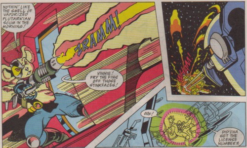
Setting up locations is only the beginning. The story has to be told between the panels, with the reader able to mentally fill in the gaps between one and the next. Unfortunately, making these transitions smooth is, again, not one of Tyler's strong suits. For example, in the first issue, we see Vinnie shooting at the Plutarkian destroyer, the ships fires back, and suddenly Vinnie is between his bros' seats. If you've seen the episode, you know that the gun was knocked out of his hands and he jumped back there to safety. Here, there's no way to tell. In issue two, when Vinnie shoots off the rocket in the garage, we see an exterior shot with two balloons saying (Vinnie) "Cool! What's it do?" and (Charley) "Don't touch it!" In the next panel, a missile is shooting toward Greasepit. That's too jerky. Where did the missile come from? Now, in the next panel, we see the smoking garage door, but it's too late. It's a little like reading a FanFic where background information is not given. If you've seen "Rock & Ride!", you can fill in the gaps between the panels without a problem, but if not, you might have some problems.
 |
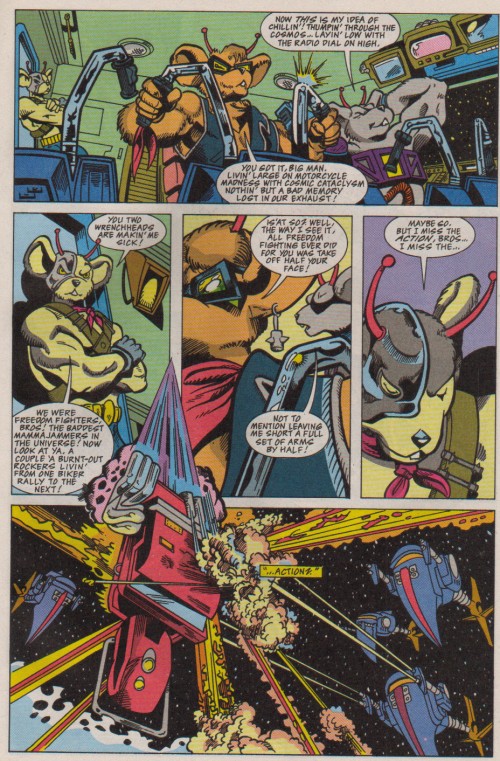
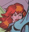
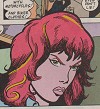
Finally, even given that we have only three issues of "Biker Mice," there's an incredible amount of inconsistency in Tyler's art style. The mice never look the same between two panels, varying between being extremely mousy-looking to more human in their depiction. And Charley! My God! Look at these pictures.
 |
 |
 |
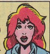 |
The first two are both from issue #1, and the second pair are from issue #2 (Charley appears only briefly in #3). Unless the inker (Gary Fields) is radically altering the pencils, this guy can't draw a person the same twice in the same issue! I expect this from an amateur artist, or someone working at a small press company (although there are some terrific artists in the small press, too), but not someone being employed by Marvel. Of course, this early in the series, Tyler might not have his groove down with regards to drawing the characters, but shouldn't there be a little more consistency between two drawings in the same issue?
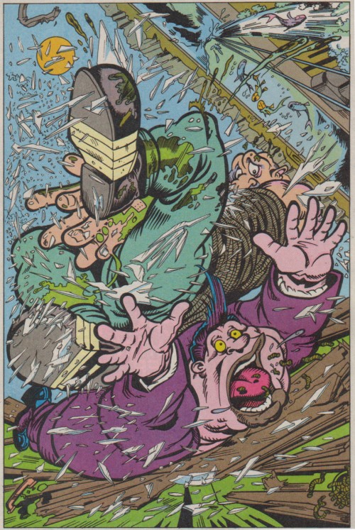
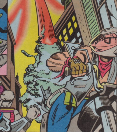
This is apropros of nothing, but doesn't it look like Throttle is really ripping a big one here?
Overall, I just don't think that Tyler was the right guy to pencil this series. Some stuff does look great, particularly his cover art. Tyler would have been perfect doing posters for the show or something. But he shouldn't have been given the reins for the series itself.
But even the pencils can be forgiven compared to the…
COLORS
Look at the cover of issue #1 of Biker Mice. What colors predominate? Dark ones. Blues, blacks, and grays. Night colors. City colors. Look at the animated series. Which colors are used most often, particularly in the first season? Again, blues, blacks, and grays. So which colors do we associate with this series? Blue, black, and gray. So what color scheme is used in the comics? Reds, yellows, orange, pinks, and purples.
…
Excuse me. I thought I was reading Biker Mice, but I must have accidentally picked up Barbie Fashion.
 |
On top of that, character colors are usually off-model. Throttle is bright orange most of the time, and Vinnie's fur often has a yellow cast. Charley's auburn hair is red-orange, and her skin is bright (I mean BRIGHT) pink. Greasepit's grease is green. Looks like "Snotpit." We don't need an exact match, but I think she could have come a good deal closer than that. Issue #2 is actually worse in color than the issues that bookend it, because everything takes on a pastel cast until the end of the issue. On the bright side, Vinnie briefly loses the yellow shading in favor of blue, which looks better on him (it returns in the next issue, however).
On top of all this, Bemko often miscolors areas. I'm not talking about simply using a different shade than what would look right. Look at this panel from issue #2, where the back of Throttle's pants is bright red. What the Hell? And this one, where Vinnie's entire face is gray. It's as if she mistakenly thought it was Modo. If you're not sure about something, ask for clarification!
 |
You may have noticed that the colors in this book look rather flat compared to contemporary comics, with little shading. Why haven't I complained about that? Simple. These comics were colored by hand, not by computers, as modern comics almost always are. It's hard to color each individual panel by hand, so I think Bemko can be forgiven for not rendering complex colors across the board. Would computer coloring have improved these books? Quite probably. Here's a challenge for anyone with the CG talent to do it: take any panel from this page, recolor it, and e-mail it to me so we can contrast and compare. Better colors might have saved the art in this book; bad colors killed it.
So now comes the big question: is it worth your while to track down and buy these books? Yes. Here's why.
Continue...
| basic information | episodes | in-depth | fun | MAIN |