PROPOSALS
| Güímar | Lanzarote |
| Icod de los Vinos | Puerto de la Cruz |
| La Gomera | Santa Cruz de Tenerife |
| La Orotava | Tacoronte |
The following proposals were made by me and sent to the corresponding corporations, with no response save in the case of Santa Cruz de Tenerife. The purpose of these proposals was, in some cases, making up for the lack of a flag, while in the other cases the purpose was to substitute flags which in my opinion are rather dull and little identificative (white clothes with the coat-of-arms in the center) with unique and visually atractive designs showing characteristics proper of the towns that they represented.

The main colour is white, referring to the town's banner. The diagonal band is inspired in the one appearing in the centre of the municipal coat-of-arms. It is green, as the most significant colour in the arms (the border), and also with the aim of representing the municipality's agricultural wealth. The ploughs appearing in the arms have been replaced by stars, since these last are a more suitable graphic element to be put on a flag.
ICOD DE LOS VINOS
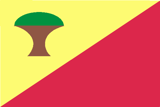
This design intends to show in the colours chosen Icod's wine-related activity, as shown in the town's name (Icod of the Wines), with light yellow standing for the white wines and dark red for the red wines. The diagonal represents the side of Mount Teide where the municipality is placed, having a decisive role in the traditional feast of Saint Andrew's boards, when the young people slide through the town's steep slopes on wood planks. Finally, the stylized drago tree represents the famous Millennial Drago, Icod's most characteristical image.


In all three proposals the main element is a cross "patée", based in the one that, according to written sources, appeared in the flag or banner carried by Columbus in his first journey, when he made an intermediate stop at La Gomera, the reason why this is called "the Columbine Island". It is to be noted that a cross very similar to this one appears in the flag finally adopted by the Insular Council. Blue, in the two first designs, means the sea.

In this design I intend to show the two most characteristc elements of the lanscape of La Orotava: snow-capped Mount Teide against the sky (white triangle on blue background) and the valley (green band).


All four proposals show the colours black, white and green as the most representative of Lanzarote's landscape: the black of the volcanic soil and the white and the green of the houses (white walls, green doors and windows). The two first proposals want to be a schematic image of this landscape: on a lava field (largest rectangle) a white house (middle rectangle), with its green doors, windows, etc. (smallest rectangle). In the first proposal, the arrangement of the rectangles has a "L" shape, the inicial of the island's name. In the two last proposals the colours have been arranged in a more conventional way.

This flag puts together two of the main elements of the town's coat-of-arms: the cross and the sea waves, thus alluding to the name of the town: Cross Harbour

This proposal shows the combination of the main element of the town's coat-of-arms (Saint James' Cross charged with a green Latin cross) with the colours of the flag of the island whose capital is Santa Cruz, equally placed in saltire.
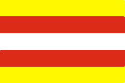


Those three designs are based upon the town's coat-of-arms:. The first proposal simply shows the coat-of-arms' main colors in horizontal stripes. The second one follows the same pattern, but adding a green grapevine leaf within a white circle as a reference to the municipality's wine production. The third design is a stylization of the arms' main charge, the white axes on red background.