
|
WET #53: Still Life!
November 19, 1999
|
 |
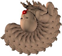
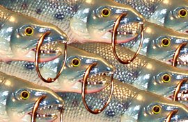
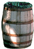
WET 53: Still LifeAll of the images are included in this picture. The copper engraving is from the band picture, as is the barrel vase. That gorgeous dog's portrait is displayed in a frame made from the menorah. The wallpaper is made from a negative image of the canman, and the table top is made from the thermometer. The letter opener is the worm can (which I tidied up and put the lid back on first!) The flowers were made by rotating and pasting many copies of the DB (dancing baby), then doing some colorizing, embossing, and layer blending. The candle was made from the salmon. And the stationery gets its color scheme from the diaper. LOL!
DETAILS: Making the baby into a flower was my biggest challenge (especially with that apple in his mouth!). I made a large canvas and kept pasting copies of the DB in, rotating each one 15 degrees further and lining up the crown of the head each time. Once I hit 180 degrees, I had half a flower. So I copied this half, added it as a new layer, rotated 180 degrees, and blended at 100 darken and merged the layers. Then I used the retouch tool to lighten and smudge the "apple" so it disappeared (more or less). I made two copies of this image; one I embossed, and the other I colorized blue. I combined them as layers, blended at 100 saturation, then merged for the final image. (I did a lot of experimenting before settling on this combination.) I then place three copies of the flower on a new layer of my main image and drop shadowed them. I also added another layer and used the bezier tool (antialiased) to create stems and slender leaves. I dropshadowed each of these (1,1)with a darker green to give some depth and definition. It was as close to Van Gogh as I'll ever get! LOL I think the candle is my favorite image (at this moment anyway!). I was really attracted to those beautiful colors on the front half of the salmon, so when I filled a square canvas with copies of the fish, I made sure that the front half overlapped the darker back half of the image below till the square was covered. (image 1) Then I added another copy of the square as a new layer, mirrored it, blended at 100% lighten and merged layers. (image 2) Then I circle deformed the result (image 3) and, finally, used vertical perspective (-65) to get the tear-drop shape. (image 4) Wick and flame were added with bezier curve, drop shadow, shape tool and almost transparent airbrush. The letter opener took a long time to make! I first cleaned up that can of worms, putting them all back inside, before trying to put the lid back on. LOL This involved lots of copying and pasting of bits of can surface, then smearing a bit with the retouch tool. The lid was removed and pasted as a new image. I resized this image to flatten it, reduced to gray scale, embossed, made a negative image, brought it back up to 16 million colors, and finally used colorize and the Hue/Saturation/Lightness controls to match the color to the can. Then I copied this and pasted it over the top of the can, using the smudge tool again to weld the edges together so the worms couldn't get back out. (grin) Here is the finished product. Next it was a matter of rotating the can to its side, resizing (not in proportion) to a flattened 262 x 16 image. I adjusted color to make this a bit more silvery blue, copied it and pasted it into the main image, rotating a bit and adding a slight blur of drop shadow. The barrel vase (or planter) was made by selecting the barrel from the band picture using the point to point selection tool. I then did a lot of copying and pasting of bits of "wood" to cover up the black plastic draped over the sides. I also spent time embossing, coloring, and texturing the plastic on the inside of the barrel to make it look more like a mossy/grassy kind of stuff. (Which ended up being almost completely hidden in the final image, LOL!) Once I had the barrel finished and looking almost new, I proceeded to posterize it (2-bit color) and add a soft drop shadow before placing it on the table top. For the wallpaper, I made a negative image of the original "canman," then filled a square canvas with several copies of the negative image. I gaussian blurred this canvas at 15.00 (yes, that's a lot!), then motion blurred 45 degrees, 40 pixels several times (5 to be exact). I then resized the image a bit to stretch it to 600 pixels wide so it would fit my final image. To make the table top, I rotated the thermometer 90 degrees to the right, added Noise at 100 Random; again added Noise at 100 Random. Then I motion blurred 0 degrees, 40 pixels before rotating 90 degrees to the right again. I copied this image, doubled the width of the canvas, pasted the copy in beside the original and mirrored it, giving a fill that would repeat smoothly on the horizontal. I made a rectangular selection on a new layer in my main image, then pattern filled with this modified thermometer image. I also used this fill for the background of the dog's portrait. I copied the dog, added a slight bit of drop shadow to him, then adjusted the canvas size to 91 x 91 pixels (so it would fit inside the menorah "frame.") Once the dog was on the background, I buttonized the whole image to give a tiled effect. The menorah frame was created by simply rotating copies of the menorah 90, 180, and 270 degrees and,along with the original, abutting each against the next to form a symmetrical frame. I drop shadowed this extensively to give the effect of being out away from the wall, then added the dog's picture in the center before adding the whole thing to the main image. The copper engraving was done by embossing the band picture, sharpening, colorizing to a general copper color, then adjusting the Hue/Saturation/Lightness to get the tone I wanted. I added the frame by picking 2 colors from this image, alternating them dark then light, using fibonnaci numbers (1,1,2,3,5,8, then 21). I buttonized the outer 21 to give depth to the frame. The stationery was made by simply creating rectangular white images, using an antialiased 1 pixel wide line to outline the edges and envelope flap. I selected "beneath" the envelope flap and added a soft drop shadow to give the effect of a lifted flap. I used a script font to put the SWAK on the envelope, as well as writing the text of the "love letter" to Rayana (European spelling, RayAnne), our WET picker's alter ego. Once the letter and envelope were created (separately), I used the skew deformation to slant the objects so they would have the right perspective for lying on the table. (I rotated the "letter" sideways first). I added a bit of subtle drop shadow to each, then copied and pasted them on a new layer on the main image. Throughout the process of making this Still Life, the various images were resized as needed to fit proportionally in the final image. |
 This is a smaller version of the original image posted for us to use. Thank you! |
You can express your opinions in my guestbook or send an e-mail below
I'll be glad to hear from you. :)
This image was created using Paint Shop Pro 5, especially for the WET #53 project.
It is my original creation based on the original WET image obtained on-line from Ray Sherman
through alt.binaries.comp-graphics.
Thank you!
|
|
|
|
5acreart@usa.net |
All original graphics on this site
Copyright 1999
by Diane at
Five Acre Graphics
This page hosted by
GeoCities