Making Link Plates - Section 3
Updated : Monday, August 03, 1998

| Mitzrah's Get IT Right Column!! Making Link Plates - Section 3 Updated : Monday, August 03, 1998 |
|
Dear budding web masters!
Right, so we have a nice shaded plate which looks reasonably good, but we are not satisfied because it doesn't look FLASH enough. Hehe! So we are going to use the buttonise tool to make it stand out a bit more. This is one of Paint Shop Pro's better tools and I like to use it lots.
- The buttonise effect can be found under the menu, you can use the mouse pointer and the effect can be found under Image -- Effects -- Buttonise... or you can use the shortcut keys, ALT + I, T, B. Once you click on it, you will now be shown this dialogue box.
- You can use the sliding bar to manipulate the image and the preview will adjust accordingly to your sliding of the width, height and opacity effects. You can also choose a bolder Solid Edge button or a more gentler sloping Transparent Edge button.
- The Auto Proof function is actually something like a preview but it happens on the image itself. It is useful when you select a region you want to buttonise and it is a part of a larger image.
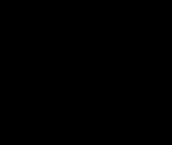
- Enter the values as shown here,
- Height : 3
- Width : 3
- Opacity : 49
- If done correctly your image will now turn like this :
- Now what we are going to do is add us some text. So one the left hand side, click on the big bold A there, it is the Add Text tool.
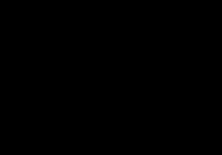
- Then position the cursor on the centre of the image. Take note of the co-ordinates on the lower left hand side of the program window. Bear in mind that our image is 100 pixels wide by 30 pixels high. So we want to position the cursor at the middle which translates to be (50, 15) Here's a diagram of what I mean :
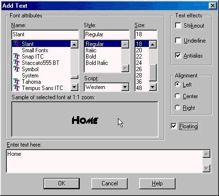
- Now click the image and you will be greeted with this dialogue box :
- I got a lot of fonts on my computer, well I don't think you'd have this Slant one, but choose any font you desire, make sure it looks not only appealing but it should be clear as in easy to read! Choose a good size for it as well, not too big or too small. Make sure than Antialias is checked because it smooths the fonts and make it look less jagged. Make sure that floating is checked as well so that it is filled with the foreground colour when done.
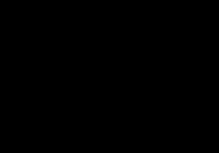
- When done, click on OK to continue. Your image will now look somwhat like so:
Please head to the Section 4 where I teach you how to use the cutout tool and drop shadow.
Notes from Alex:
If you found my guidance helpful, please drop a note by my guestbook! So I know that you have dropped by and benefitted from my efforts, it took me quite sometime to get these tutorial up! Click on home and then SIGN GUESTBOOK! I will also visit your homepage and will sign your guestbook too.
|
||
[ Emiri Nakayama | Sailor Mars, Rei | About Me | Photo Gallery ] |
 |
|
| LinkExchange Member | Free Home Pages at GeoCities |