
|
|
![]()
|
|
Home Marketing | A & A Readings Portal | |
| Consumer Behaviour | Marketing | Marketing Management | Marketing Research |
| Home Information Technology |
|
||
![]()
Article published in DM Review Magazine
September 2006 Issue
With business spread around the world and changing constantly, those who plan and execute performance strategies need the latest information as soon as it becomes available. Advances in technology helped create these conditions, and new developments can assist businesspeople in dealing with them. In particular, three related technologies - scorecards, dashboards and performance alerts - establish meaningful contexts that enable users to analyze, measure, share and act on information quickly.
Scorecards, dashboards and alerts all support performance management but differ significantly in how they do so. A dashboard is an application that helps you monitor an organization's performance, whereas a scorecard helps you manage performance. Performance alerts are notifications of key trends or business events that tie to either scorecard or dashboard goals.
For example, a typical manufacturing business would use a corporate scorecard to manage its overall progress toward a yearly strategic goal, such as expanding market share in Asia, by mapping its operational, financial, customer and organizational expansion initiatives to specific scorecard measures. The scorecard then would show not only progress toward the goal but also where imbalances exist and where action needs to be taken.
Dashboards, on the other hand, are a way to display and monitor progress on organizational business process and individuals' measures, such as sales quotas and product quality. Users can then set performance alerts to monitor dashboard or scorecard measures that notify them of actual or potential goal shortfalls, such as a poor regional revenue outlook or rising complaint calls at the contact center.
As part of Ventana Research's ongoing primary research, we set out to learn how extensively companies are employing these tools and to determine trends and priorities in their use. In January and February 2006, we conducted a survey of 590 managers and analysts in companies that use scorecards, dashboards and performance alerts. Nearly half (45 percent) of the respondents came from the lines of business, followed by 41 percent from the IT function. Finance accounted for 11 percent of respondents, and the remaining three percent work in HR. The survey participants are from a variety of industries, none of which contributed more than 14 percent of the respondents.
Our analysis of the survey results yielded a wealth of data about how these organizations are using the tools. From encouraging trends to inhibiting limitations, from expressions of satisfaction to complaints about functionality, they showed that scorecards, dashboards and performance alerts carry great potential as business tools, although most companies have yet to apply their full capabilities. We hope that the following highlights of the study will add to general awareness of what these tools are and are not being used for and how they may help other businesses in meeting the incessant challenges of change.
Ventana sought to learn why companies are deploying scorecards, dashboards
and performance alerts. The top business driver that respondents cited for
adopting them is to align operations with corporate strategy and goals.
Approximately one-third of companies identified this as the most significant
reason for their initiative. It was most prevalent for scorecards (36 percent),
not quite as much for dashboards (29 percent) and least so for alerts (24
percent) (see Figure 1). We consider this significant because alignment is a
step toward performance management, which links strategy with corporate
objectives in ways that make the best use of a company's resources by
coordinating the efforts of every member of the organization.
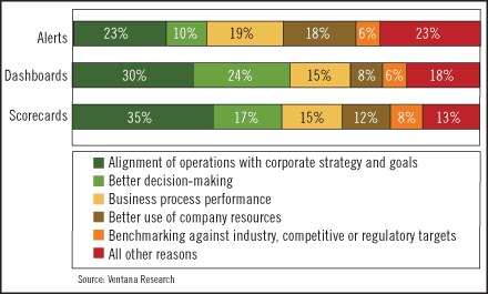
Figure 1: Why do companies adopt scorecards,
dashboards and performance alerts?
The similarity of responses regarding scorecards and dashboards is one indication that there is not a clear distinction between the two in the marketplace and that companies use the terms interchangeably. Other responses confirmed this conclusion. In theory, scorecards follow a management methodology; there is no such requirement for dashboards. But when scorecards are deployed without a clear underlying methodology, the line between the two gets blurred.
Following closely behind alignment as a business driver for adoption were improvement in decision-making, business process performance and use of company resources. These suggest that many companies do not currently use these tools to drive strategy developed at the executive level throughout the organization.
Respondents ranked supporting better decision-making as the second most important deployment reason for scorecards and dashboards, but for performance alerts it came fourth, at 10 percent, behind both improved business process performance (19 percent) and better use of company resources (18 percent). We were not surprised by this finding because alerts are often used to monitor business processes and events in order to reallocate resources in response to changing needs.
Today, deployments of scorecards, dashboards and performance alerts are small: the majority of companies (60 percent) have fewer than 100 users. Nevertheless, the results show that IT departments plan to considerably increase the number of users these applications serve. Over the next 12 months or at full deployment, the number of projects having more than 100 users will increase in more than 20 percent of the companies surveyed.
As well as being small, many current deployments are narrowly focused.
Generally, scorecards, dashboards and alerts are being deployed, in order of
most to least often, to finance, sales, IT and marketing. The frequency of
deployments into the sales function confirms that companies value revenue goals
tracking over tracking balanced measures of executing operational strategy. We
also found that the lowest frequency of deployment occurs in supply chain and
customer operations.
This narrow focus is confirmed by a look at who uses the tools. The largest group is mid-level managers rather than executives. Simply put, scorecards and dashboards are most often being deployed tactically as supervisory tools for middle managers rather than strategically as a tool for top executives to manage the health, direction and performance of the business.
Following up on the number-one business driver, our study found that
scorecards and dashboards are effective in helping companies achieve alignment
to goals and strategies. Only about half of the respondents reported that before
using them they were effective in achieving performance alignment, but after
adopting them more than 80 percent said this (see Figure 2). Backing up this
finding, less than one-fifth of respondents said they have difficulty
quantifying a clear ROI or finding room in their budgets for these initiatives.
This seems to be a positive endorsement because these two challenges are often
the biggest hurdles to deployment of new software applications.
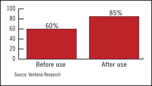
Figure 2: Do scorecards help to achieve
performance alignment?
In other areas of effectiveness, however, responses were mixed. Strong
majorities of scorecard users reported that they receive the right amounts of
information on achieving company goals and objectives (78 percent) and
concerning business unit performance (79 percent) (see Figure 3). A smaller but
still substantial percentage of respondents (61 percent) said that they receive
approximately the right amount of information on leading indicators about
company health.

Figure 3: Do scorecards provide the right
amounts of information?
On the downside, only approximately half (53 percent) said they get the right amount of information on achieving individual workers' objectives. And 42 percent declared that their scorecard provides too little information in this area.
More than half of respondents (53 percent) said that dashboards track progress toward goals and objectives, but 41 percent indicated that their dashboards do not do it well enough. This is a concern because the purpose of a dashboard is to give executives a single-screen information center that focuses exclusively on their enterprise.
Similarly, only half of the users believe their data is sufficiently timely; the other half says it is often out of date. This finding undercuts the core value of dashboards and alerts, which is to quickly notify users of performance issues and guide them to take immediate action.
While 38 percent of respondents said their alerts were always timely, 57 percent said they were sometimes out of date. Respondents also felt that performance alerts are not in sync with goals and measures. While users reported getting both detection alerts (about what has happened) and prediction alerts (about what will happen), their biggest complaint was that alerts are not indexed to specific performance goals (36 percent). They also complained that alerts are not tied to their scorecards and dashboards. We found this lack of connection alarming because context is critical if alerts are to aid in managing performance.
Business users' number-one complaint about their scorecards and dashboards - each cited by 42 percent of respondents - was an inability to drill down to details. Revealing something of a disconnect, IT said business users complain most about a lack of data integration from multiple sources. We suggest that data integration is not actually a business user complaint, but rather is the root cause of many complaints that business users have, including the inability to adequately drill down. Users also complained about problems in defining key performance indicators and in changing perspectives on the fly.
In looking for the sources of these and related inadequacies, our survey found that, despite the availability of mature offerings from software vendors, 64 percent of scorecard, dashboard and performance alert applications are developed internally by IT departments. One result of this tendency is that users don't get capabilities such as drill-down tools that support detailed analysis and thus better decision-making. IT departments could address many of these complaints by choosing to seek out commercial products that integrate data and provide detailed analysis.
The reliance on homegrown solutions extends to the methodologies on which companies base their scorecards: 37 percent use their own internally developed methodology. Only one-fourth use the balanced scorecard method. The remaining 38 percent are dispersed among 10 different methods. We conclude that many companies are not following well-defined methodologies in this area. When so many scorecards are internally developed, it is likely that measures are not the same from company to company.
To fully benefit from deploying scorecards, dashboards and alerts, companies will need to accept that achieving success takes time. Our research shows that it can take up to two years to optimize the content and context of these tools. Even though the technology can be implemented quickly, its use requires individual and cultural change, which takes longer. We also find that executive sponsorship matters. When the CEO or CFO is a sponsor, there is a greater likelihood of adoption and less likelihood of project abandonment.
We recommend that companies employ a step-by-step approach to developing solutions, one in which IT and users consistently re-evaluate requirements through a formal process, whether they build the applications in-house or purchase them from vendors.
Colin Snow is VP and research director - Operational and Supply Chain Performance Management. Snow heads up the Ventana Research Operational Performance Management (OPM) practice focusing on the alignment of business and information technology in the areas of supply chain, operations and business process management. His research investigates what organizations need to manage their operational processes and supply chain for performance improvement.
![]()
Customer value models are powerful tools to improve business strategy, tactics and reporting, but they need a lot of input data, which is not always fully available. Some people object to the models for this reason. Their concern is that incomplete data will yield inaccurate results, leading to worse decisions than no model at all.
There are ways to overcome data limits. One is to model only areas where detailed data is available. For example, log files can capture a precise history of a customer's behavior on the Web. Marketers may build a customer value model to help with Web-related decisions even if non-Web behavior is modeled in much less detail.
Another option is to use aggregate values. A model might apply the same average payment rate to all customer segments when actual rates by segment are not known. Sensitivity analyses can determine whether variations across segments would really make a difference in relevant outputs. If so, special studies can sometimes discover the actual values when these are not available from regular reporting systems. Even without such studies, managers can estimate the different segment values and use simple math to ensure that the weighted average of the estimates matches the value of the actual average itself.
One more approach is simply to model with less detail. Again, sensitivity analysis can determine whether working with a simpler model affects the utility of these results.
Which, if any, of these approaches makes sense will depend on the situation. Often a useful model can be built using the available data. Sometimes it cannot.
But even when a true customer value model is not possible, customer value metrics can still be used. Such metrics present the inputs to a customer value model for users to evaluate directly. Although they do not provide the long-term value projections of an actual model, they can still give important insights into business performance and trends.
These metrics are based on the fundamental customer value equation: customer value is equal to acquisition value plus future value. Acquisition value is the net cost to acquire new customers. It includes prospecting costs less any revenues from the initial acquisition transactions. Future value is customer value per period multiplied by the average number of periods in a customer lifetime. Value per period is the net of customer revenues less costs. Periods per lifetime is derived from retention rates.
Standard accounting systems do not measure customer value directly. Yet nearly all can link transactions to customers and transaction dates. This means they can determine which customers purchased during current and previous time periods. (It doesn't matter whether these periods are days, weeks, months or years. Nor must the previous and current period be the same length. In some cases, it may make sense for the previous period to include activity over the past year, while the current period looks only at the current month.) Once customers have been classified this way, they fall into four categories:
These can be displayed neatly in a two-dimensional matrix as shown in Figure 1.

Figure 1: Customer Classification Matrix
All the inputs for a simple customer value model can be derived from these values.
The specific customer value figure that results from this calculation can be intriguing, but it has little practical use. The real value comes from examining the input figures themselves; how they change over time, in particular. The matrix described in Figure 1 can be interpreted as illustrating stages in a customer life cycle: from new through active to lost to inactive and possibly new again. Viewed over successive time periods, the values in each cell illustrate this flow.
From this perspective, changes in relative values indicate whether a company is growing or shrinking its customer base and whether retention rates are improving or getting worse. Changes in financial values show whether revenue is growing by adding new customers or expanding relationships with existing ones. Comparing past period financial values of lost customers with current values for actives give some insight into the quality of customers being lost. A complete set of relevant metrics is illustrated in Figure 2:
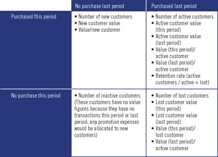
Figure 2: Relevant Metrics
Because period-to-period changes are so important, a matrix is less effective at presenting the data than a columnar format showing several periods simultaneously. This is similar to any traditional report comparing current and past results (see Figure 3).
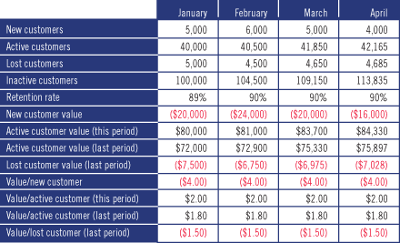
Figure 3: Report Comparing Current and Past Results
A natural extension, also common to such reports, is to calculate differences between one period and the next. Exception reporting can then highlight changes that might need closer examination. Add some attractive graphics and you have the basis for a customer value dashboard (see Figure 4).

Figure 4: Report Calculating Differences Between Periods
In the hands of an insightful reader, such reports are a powerful tool for understanding the business. Drill downs to finer detail add even more value. These might present the same metrics for subsets such as specific products or customer segments. Or they might break the aggregate metrics down into components such as different categories of costs.
These refinements are common to many types of reports. What's important is not such details, but basing the report on customer value metrics. This incorporates the customer value perspective into corporate reporting even when customer value modeling itself is not a practical option.
David M. Raab is President of Client X Client, a consulting and software firm specializing in customer value management. He may be reached at info@raabassociates.com.
![]()
Column published in DM Review Magazine
February 2006 Issue
![]()
My previous column showed how standard financial information can be transformed into customer value metrics to gain important insights into business performance. There are many ways to present these values, and the methods chosen will greatly affect the utility of the final product. Here are some guidelines for preparing a customer value dashboard.
First and foremost, the information should be relevant to the recipient. Otherwise, the dashboard will quickly become part of the background noise that every competent manager quickly learns to ignore. No one has time to dig through lengthy reports on the off chance that they may contain something important.
One component of relevance is personalization: recognizing that different people need different information and presenting something suitable to each person. However, listing personalization as a requirement simply begs the question of what each recipient's personalized dashboard should include.
The primary criterion for inclusion is whether the recipient can do anything with the information. Let's call this "actionability." Sometimes it's obvious how to be actionable: if the Web campaign is pulling in responses at a lower-than-expected cost per order, the system should alert the Web marketing manager and suggest expanding the campaign. But in most cases, figuring out who can react to a particular bit of information is not easy. Does a decline in sales call for action from marketing, sales, operations or someone else? Often, the best that can be done is to present the information to everyone who might reasonably be expected to respond to it and let them determine what to do next.
This could result in presenting nearly everything to everyone: not a viable approach. A second component of relevance, then, is the business value of presenting a particular piece of information to a particular individual. This value combines the ability of that person to act on the information with the expected value of their action. A circulation director may have full control over the costs of subscription premiums, but the amount of money involved could be insignificant. Or, postage costs may be very important but quite beyond the circulation director's control. There is little business value in presenting the circulation director with either piece of the information.
Relevance also requires that the recipient understand why the information is being presented. It is very difficult to interpret a single value by itself. Most information makes more sense when compared with something else - a budget or forecast, a previous period, a similar line of business. But variances are not sufficient either. Is a 20 percent increase in customer service costs good or bad? It depends on how much the business has grown, whether the product mix has changed and many other considerations. The dashboard must factor in such elements before calling the variances to a manager's attention. A system that presents too many false alarms will soon be ignored.
Yet even small variances can be significant if they are caused by large variances in particular business segments. Customers from a new source may have an attractive acquisition cost but also low payment rates. If the quantity is small, the change in overall payment rates won't be noticed unless payments are examined by source - or until business from that source is increased, with disastrous results. The dashboard system needs to examine the business in detail, even if the dashboard itself only includes summary figures. Then, the dashboard system must alert managers of variances at the detail level that are worth a closer look.
Variances can indicate opportunities as well as problems. Helping recipients to understand the true meaning of a variance requires showing its long-term implications. A small change in retention rates may have little impact on current period revenues but foreshadow huge changes in the future. To identify such situations, the dashboard system must embed its metrics within a larger business model. This model will calculate how changes in each metric relate to overall business performance. The dashboard system must then use these calculations to help prioritize the information it presents to each user.
My next column will discuss additional factors to consider when designing dashboard contents.
David M. Raab is President of Client X Client, a consulting and software firm specializing in customer value management. He may be reached at info@raabassociates.com.
Column published in DM Review Magazine
March 2006 Issue
![]()
Last month's column emphasized the importance of presenting information that is personalized, actionable and meaningful - in short, relevant - in a customer value dashboard. But that's not all. Dashboard contents need to meet other conditions to be truly useful.
Fresh means more than just showing the latest information available. The dashboard must highlight the implications of that information. For example, new customers from different sources may be known to perform differently in terms of subsequent purchases. When the mix of customers changes, the dashboard needs to show the expected impact of the new mix on future revenues, not simply report the mix change or, worse still, just the total revenue from the current month.
In businesses with regular contract renewals, such as mobile telephones, leading indicators of renewal rates are often available well before the actual expiration date. The dashboard needs to report the expected renewal rate based on the status of those indicators, rather than waiting until final results are in.
In addition, the dashboard should show how expectations have changed based on the latest batch of data compared with the previous batch. Long-term forecasts from narrow slices of data - perhaps one month's transactions - will necessarily be volatile, so some smoothing will be required. How to do this without hiding whatever interesting trends are embedded in the data is part of the art of designing such systems. Some false alarms are inevitable, and some real problems will be missed for a time; but it's better to try to forecast and make some mistakes than to report only actuals and have no advance warning.
The dashboard should not show static or redundant information. Values that are updated monthly should not appear in a daily dashboard report, although they should be available for review at any time. Better to have a daily report for information that appears daily, such as Web marketing campaign results (which might actually be updated much more often - perhaps every 15 minutes). Provide a separate tab for monthly information and highlight this tab on the day the new month's results are released. This will encourage users to check the new monthly figures when they are at their freshest and, therefore, when users have the most possible time to react. Like old information, redundant data makes the dashboard harder to use because the viewer must look in more places to learn something new. It is better to present important information in one place and then go on to something else - always keeping the older information available for recall if a user should need it and giving the user the option to combine information in different ways when it suits her purpose.
Information in the dashboard must not only be correct, but it must be accepted as correct. This means users need to be able to relate it to other data sources they already trust. It is not a matter of presenting the same numbers as older sources; a customer value dashboard is likely to include forecasts and aggregations that are not found elsewhere. Users should be able to dig into the dashboard calculations to see how they were generated and what data they are based on. They should be able to tie this underlying data back to existing, trusted sources.
Dashboards have pretty dials and gauges and warning lights, but these aren't just for decoration. They are used to make the information more understandable and to direct users to the areas requiring attention. Users should have some control over what is included and how it is presented because different users have different styles of absorbing and working with data. The components themselves need to be more than pretty pictures. They must be connected with underlying information so users can dig into an interesting item to find out more details.
In the case of customer dashboards, it is also important to clearly distinguish actual values from projections so users can understand which items might be changed by management actions. Ideally, the dashboard would include simulation and modeling capabilities that let users explore the impacts of alternate assumptions or changes in future results - although this is arguably extending beyond the scope of the dashboard itself.
David M. Raab is President of Client X Client, a consulting and software firm specializing in customer value management. He may be reached at info@raabassociates.com.
![]() Article published in DM Review Magazine
Article published in DM Review Magazine
June 2006
Issue
![]()
One of the most common questions people ask about performance dashboards is, How do we define effective key performance indicators (KPIs)? The answer is important because KPIs govern how employees do their jobs.
The adage "What gets measured, gets done" is true. KPIs focus employees' attention on the tasks and processes that executives deem most critical to the success of the business. KPIs are like levers that executives can pull to move the organization in new and different directions. In fact, among all the tools available to executives to change the organization and move it in a new direction, KPIs are perhaps the most powerful.
Subsequently, executives need to treat KPIs with respect. As powerful agents of change, KPIs can drive unparalleled improvements or plunge the organization into chaos and confusion. If the KPIs do not accurately translate the company's strategy and goals into concrete actions on a daily basis, the organization will flounder. Employees will work at cross purposes, impeding each other's progress and leaving everyone tired and frustrated with little to show for their efforts.
A trucking company, for example, that measures performance by the percentage of on-time shipments may drive hauling costs skyward because the KPI does nothing to discourage dispatchers from sending out half-empty trucks to meet their schedules. To keep costs in line, the company needs to add a second KPI that measures the percentage of unused cargo capacity in outgoing trucks, and it needs to revise the first KPI so it emphasizes meeting customer expectations for fast, reliable shipments rather than just on-time deliveries. This combination of KPIs gives dispatchers leeway to contact customers and renegotiate shipping schedules if they know the customer may be flexible.
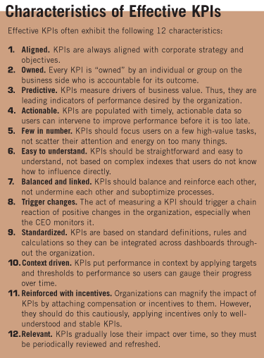
Crafting sound KPIs is more of an art than a science. Although there are guidelines for creating effective KPIs (see sidebar), they do not guarantee success. A KPI team may spend months collecting requirements, standardizing definitions and rules, prioritizing KPIs and soliciting feedback - in short, following all the rules for solid KPI development - but still fail. In fact, the danger is that KPI teams will shoot for perfection and fall prey to analysis paralysis. In reality, KPI teams can only get 80 percent of the way to an effective set of KPIs; the last 20 percent comes from deploying the KPIs, seeing how they impact behavior and performance, and then adjusting them accordingly.
Metrics used in performance dashboards are typically called key performance indicators because they measure how well the organization or individual performs against predefined goals and targets. There are two major types of KPIs: leading and lagging indicators. Leading indicators measure activities that have a significant effect on future performance, whereas lagging indicators, such as most financial KPIs, measure the output of past activity.
Leading indicators are powerful measures to include in a performance dashboard but are sometimes difficult to define. They measure key drivers of business value and are harbingers of future outcomes. To do this, leading indicators either measure activity in its current state (i.e., number of sales meetings today) or in a future state (i.e., number of sales meetings scheduled for the next two weeks), the latter being more powerful because it gives individuals and their managers more time to influence the outcome.
For example, Quicken Loans identified two KPIs that correlate with the
ability of mortgage consultants to meet daily sales quotas: the amount of time
they spend on the phone with customers and the number of clients they speak with
each day. Quicken Loans now displays these two current-state KPIs prominently on
its operational dashboards. More importantly, however, it created a third KPI
based on the previous two that projects whether mortgage consultants are on
track to meet their daily quotas every 15 minutes. This future-state KPI, which
is based on a simple statistical regression algorithm using data from the
current-state KPIs, enables sales managers to identify which mortgage
consultants they should assist during the next hour or so.
Some of the challenges with creating effective KPIs include process nuances, activity measurement, accurate calculations and lifecycle management.
Process Nuances. The problem with many KPIs is that they do not accurately capture the nuances of a business process, making it difficult for the project team to figure out what data to capture and how to calculate it.
For example, executives at Direct Energy requested a repeat-call metric to track the efficiency of field service technicians, but it took the project team considerable time to clarify the meaning of the KPI. For example, field service technicians primarily repair home energy equipment, but they can also sell it. So, is a repeat call a bad thing if the technician also brings literature about replacement systems or makes a sale? Or, what if a homeowner only lets a technician make minor repairs to an aging system to save money but calls shortly afterward because the home's furnace broke down again?
Most business processes contain innumerable nuances that must be understood and built into the KPI if it is to have any validity, especially if the KPI is used as a basis for compensation. The worst-case scenario is when employees discover these nuances after the KPIs have been deployed, which stirs up a hornet's nest of trouble and wreaks havoc on both the performance management system and compensation policies.
Accurate Calculations. It is also difficult to create KPIs that accurately measure an activity. Sometimes, unforeseen variables influence measures. For example, a company may see a jump in worker productivity, but the increase is due more to an uptick in inflation than internal performance improvements. This is because the company calculates worker productivity by dividing revenues by the total number of workers it employs. Thus, a rise in the inflation rate artificially boosts revenues — the numerator in the KPI — and increases the worker productivity score even though workers did not become more efficient during this period.
Also, it is easy to create KPIs that do not accurately measure the intended objective. For example, many organizations struggle to find a KPI to measure employee satisfaction or dissatisfaction. Some use surveys, but often employees do not answer the questions honestly. Other companies use absenteeism as a sign of dissatisfaction, but these numbers are skewed significantly by employees who miss work to attend a funeral, care for a sick family member or stay home when day care is unavailable. Some experts suggest that a better KPI, although not a perfect one, might be the number of sick days taken because unhappy employees often take more sick days than satisfied employees.
Natural Lifecycle. It's also important to note that a KPI has a natural lifecycle. When first introduced, the KPI energizes the workforce, and performance improves. Over time, the KPI loses its impact and must be refreshed, revised or discarded. Thus, it is imperative that organizations continually review KPI usage.
Performance dashboard teams should automatically track KPI usage with system logs that capture the number of users and queries for each KPI in the system. The team should then present this information to the performance dashboard steering committee, which needs to decide what to do about underused KPIs. For example, Hewlett Packard Technology Solutions Group (TSG) holds quarterly meetings to review KPI usage, which it tracks at a detailed level. "If a KPI isn't being accessed, we go back to the owners and see whether they still want it. If not, we remove the KPI," says Martin Summerhayes, program manager.
KPIs are powerful agents of organizational change, but creating effective KPIs is challenging; it is more art than science. While there are many guidelines that can steer teams in the right direction, ultimately, teams must put the KPIs in practice and see what behaviors they drive. Then, the teams need to continually refine and refresh the KPIs to ensure that they are positively affecting organizational change, not undermining it.
Wayne Eckerson is director of research at The Data Warehousing Institute, the industry's premier provider of in-depth, high-quality training and education in the data warehousing and business intelligence fields. He can be reached at weckerson@tdwi.org.
![]()
![]()
![]()

![]()
Copyright © 1997-2006 [A & A Trading Enterprises]. All rights reserved.