History of Our Logo
Our current logo is our second logo, which was created from a picture out of the Bible.
 In
the early 1990's, when Windy Hollow wasn't a riding school, it was a base organisation that presented competitive events to the local equestrian
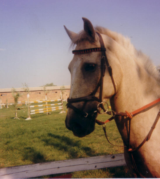
fraternity. At this time its logo was a pony that was bucking, based on one of my first horses, Sarizin from way back in
1982, with this logo still being valid when Windy Hollow shifted is working focus to offering little children riding lessons,
but now that we have shifted our focus yet again to offering "Equine Facilitated Movement Therapy", it needed to be changed.
The original
logo was created in two versions a black and white and a colour version.
In
the early 1990's, when Windy Hollow wasn't a riding school, it was a base organisation that presented competitive events to the local equestrian
fraternity. At this time its logo was a pony that was bucking, based on one of my first horses, Sarizin from way back in
1982, with this logo still being valid when Windy Hollow shifted is working focus to offering little children riding lessons,
but now that we have shifted our focus yet again to offering "Equine Facilitated Movement Therapy", it needed to be changed.
The original
logo was created in two versions a black and white and a colour version.
 At the time that the change was discussed, designed and applied, Windy Hollow had two students from Namibia, who both had
artistic ability. When we started looking for ideas for our new logo, we started collecting and comparing other organisations
logo's, discussed what each logo was saying about the organisation. With this in mind we started with our national equestrian
body SANEF's logo, and then other international organisations that also focused on therapeutic riding.
At the time that the change was discussed, designed and applied, Windy Hollow had two students from Namibia, who both had
artistic ability. When we started looking for ideas for our new logo, we started collecting and comparing other organisations
logo's, discussed what each logo was saying about the organisation. With this in mind we started with our national equestrian
body SANEF's logo, and then other international organisations that also focused on therapeutic riding.
 We found that a line drawing of a horse was popular, we also found that the wheel chair symbol was to be found in some
form on most of these logo's. We discussed at length where to find a line drawing that could be adapted, the process was
derailed on one hand and solved on the other, when my father passed away.
We found that a line drawing of a horse was popular, we also found that the wheel chair symbol was to be found in some
form on most of these logo's. We discussed at length where to find a line drawing that could be adapted, the process was
derailed on one hand and solved on the other, when my father passed away.
 One of the students, needing to find extra strength to help me cope with what had happened, was sitting reading her bible when she found the base picture that she
worked from to create the new logo, in Ecclesiastes 10.7. Our vision of making horses available to individuals who would
otherwise not be given the chance was given legitimacy. (Ecl. 10.7, I have seen slaves on horseback while noblemen go on
foot like slaves.)
One of the students, needing to find extra strength to help me cope with what had happened, was sitting reading her bible when she found the base picture that she
worked from to create the new logo, in Ecclesiastes 10.7. Our vision of making horses available to individuals who would
otherwise not be given the chance was given legitimacy. (Ecl. 10.7, I have seen slaves on horseback while noblemen go on
foot like slaves.)
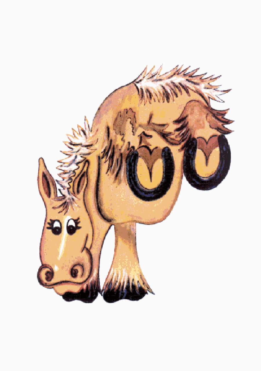
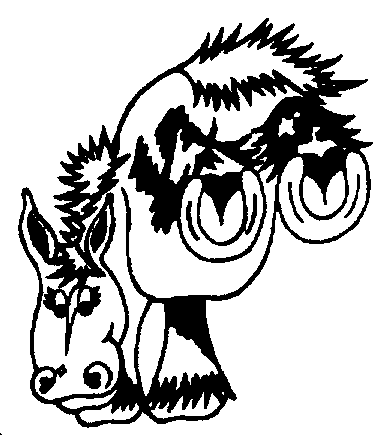
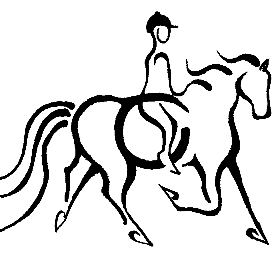 Above is the picture from the Bible, then the first picture created from this for the new logo, with
the ring to represent the wheel chair symbol and our original logo. Notice is our current logo the horse is facing right
while the first draft of this and the picture out of the bible the horse is facing left. The reason for this is as a result
of a comment made by a biker who helped us at one stage, he said our logo is facing backwards, we write on a page from the
left to the right
Above is the picture from the Bible, then the first picture created from this for the new logo, with
the ring to represent the wheel chair symbol and our original logo. Notice is our current logo the horse is facing right
while the first draft of this and the picture out of the bible the horse is facing left. The reason for this is as a result
of a comment made by a biker who helped us at one stage, he said our logo is facing backwards, we write on a page from the
left to the right 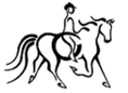 and in doing that we are facing our horses tail in the direction we are going - hence the direction in
which the horse is facing has been flipped to allow the horse to move forward.
and in doing that we are facing our horses tail in the direction we are going - hence the direction in
which the horse is facing has been flipped to allow the horse to move forward.
![]()
"It's better to want the horse that you don't have than to have the horse that you don't want."