Excel 2000 Module 5
Charts
Charts can summarize, highlight, or reveal trends in your data that might not be obvious when looking at the raw numbers.
Creating Charts using the Chart Wizard
Excel Chart using chart wizard - a step-by-step set of dialog box that guide you through the creation of a chart. To start, you select the type of chart you want - Excel offers 14 types, with each type having two or more subtypes.
Step
1 : 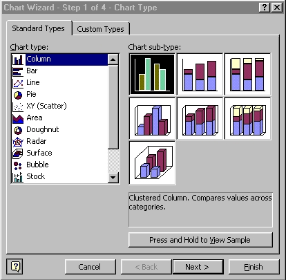
Step
2 : 
Step
3 : 
Step
4 : 
Start <Excel>
Click <File>, <New>
Click <Sheet1>
Rename <Sheet1>
to <M5Ex>
Practice M5Ex
Select
Range
A2:F6

Click <Chart
Wizard> button

The Step 1 of 4 - Chart Type dialog box appears
Select <Chart
Type list Column>
Click <Stacked
Column sub-type>

Click <Next>
The Step 2 of 4 - Chart source Data dialog box appears with a
preview of your chart

Click <Next>
The Step 3 of 4 - Chart Options dialog box appears
Type at <Chart
title:> Yearly
Sales

Click <Next>
The Step 4 of 4 - Chart Location dialog box appears

Click <Finish>

The
Chart appears in the worksheet as indicated by your Selection
in As Object in option
Moving, Resizing, and Deleting Charts
Once a chart is created, you can position it where you want in the worksheet, change its size, or delete it altogether. To move, resizes, or delete a chart, you must select the chart by clicking in the Chart Area.
Click Chart Area

Resizing, Moving (Drag-and-drop)
Modifying Chart Titles and Adding Axis Labels
When you create a chart using the Chart Wizard, besides the Chart Title, you can include the necessary information by changing the chart options later.
Click Chart Area
Right-click, Click Chart Options
Type at <Chart title:> Five-Year Revenue Projection
Type at <Category (X) axis:> Fiscal Year
Type at <Value (Y) axis:> Revenue (in thousands)

Click Chart Title
Right-click, Click Format Chart Title
Click <Font> tab
Click at <Size> 12

Click <OK>
Moving and Formatting Chart Elements
To emphasize certain values, you can add labels to each data point on a chart.
Click Chart Legend
Drag to the lower left corner of the Chart Area

Right-click Chart Legend
Click <Patterns> tab
Select <Shadow> box Click <OK>
Adding Gridlines and Arrows
Horizontal and vertical gridlines can help identify the value of each data marker in the chart. Arrows can be used to highligh a particular data marker or call attention to certain information in a chart.
Click Chart Area
Right-click, Click Chart Options
Click <Gridlines> tab
Select Major gridlines check box
Select Minor gridlines check box


Drawing Tools :
Menu, Point and click <View><Toolbars> : click Drawing

Click
<Arrow>
button, point to the highest chart, point and click away from
the chart

Click
<Text
Box> button, point to the arrow, point and drag a rectangular
box
Type Largest
Projected Increase
Previewing and Printing a Chart
The Print Preview command displays the chart just as it will be printed, allowing you to verify the appearance and layout of your chart before printing.
Print Preview for previewing any Windows 2000 document using the WYSIWYG (pronounced wizzy-wig) as an acronym for What You See Is What You Get, the concept that your screen shows your output as it will look on paper : change most print settings such as Set Margins, Print Area and Print Order, preview the data, and print the worksheet.
Click <Print Preview> button

The worksheet and embedded chart appear in the Preview window.
Click <Zoom>
Printer subsystem is the Windows printer interface for direct printed output for all your Windows programs. Click <Print>
Alternatively
Menu, Point and click <File>: click
Print


Click
<Close>
Print Preview
Changing the Chart type and Organizing the Source Data
Excel offers a wide variety of chart types because each type emphasizes a particular aspect of the source data - being organized in rows or columns.
Click Chart Area
Right-click, Click Chart Type
Click at Standard Types Click Area
Click Stacked Area

Click <OK>
Click Chart Area
Right-click, Click Source Data
Click <Data Range> tab
Click at <Series in:> for <Rows>
Click <OK>

Click
<File>
<Save>
Click <File> <Close>
Practice
Exercise 1 :
M5:
Page 16
Click
<Sheet2>
Rename <Sheet2>
to <M5Ex1>
Create the chart
 Edwin
Koh : We
completed on the New
Knowledge and Skills in
Edwin
Koh : We
completed on the New
Knowledge and Skills in
Excel
2000 Module 5.