Site Review: OWO |
|
Roster |
| Size: 23 members |
| Titles: 10 titles |
| OOC Atmosphere: Seem to know each other farily personally. Quick responses, and board is very active. |
| Role-playing: The role-plays I've read seem to have a lot of "character" in them, definately good, a bit more expansion on descriptions for mostly everyone though. |
Features |
| Legends: Feature not showing much life to it. |
| Hall of Fame: Yet another feature with no life in it. |
| Hall of Shame: Another feature that doesn't have anything to it. |
| Awards: Nothing here |
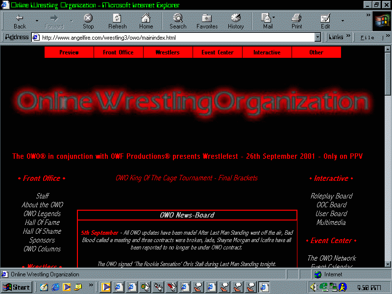
Site Design |
|
Commentary |
| Site could use a lot of work put into it. As a starter most
of the sections aren't updated. More content should be put into the site, and if
it's time prevailing have some kind of "Will Be Here" message to it. The DHTML menus simply have to go. If it's broke, either fix it or remove it. I suggest either fixing the menus or simply not using them at all. Make sure that the navigation bars on the side are linked to every page, or you have a link back to the main page. Such hassle to find that. I looked at the pay-per-view to see a "King of the Cage" contest. In all respects I'd really like to think this was my idea. In fact, he used the same type of brackets I used, same colors, same form, hm.... As a suggestion maybe fusing the women's, heavyweight, and cruiserweight rosters into one. You're alienating women by sticking them in their own classification even when they could fit in another. I liked the few biographies that were up, but I suggset possibly getting them all up. As in doing the biographies first, than putting the wrestler on the site. It doesn't look good when you have some with bios and some without. Although having contracts is nice to have, the contracts should be apart of the roster. Splicing sections up just makes it more of a hassle for handlers to have to move around the site. Results look nice though, it'd be a lot easier to read if all the text was aligned to the left instead of the center though. Overall it needs improvement. Many things like sponsors and ratings seem unrealistic. I suggest going over the site again and lookin for what should be improved. |