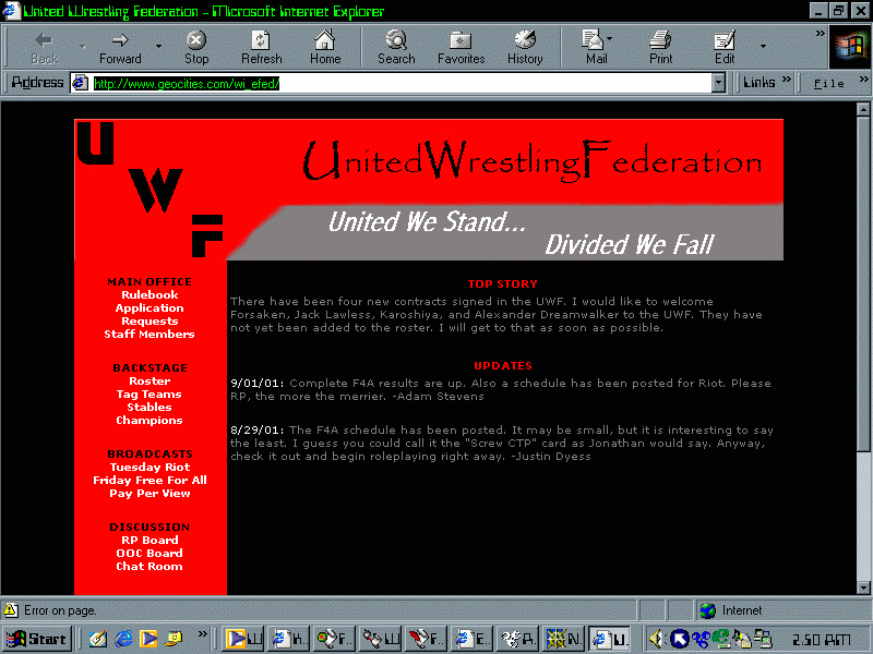
Site Review: UWF |
|
Roster |
| Size: 15 members |
| Titles: 7 titles |
| OOC Atmosphere: Nice OOC atmosphere, people are having nice discussions over wrestling and events in the fed |
| Role-playing: Below par role-playing, many concepts of writing are missing in many of the role-plays I saw. |
Features |
| Info Report: Very nice section completel with an over view rewarding members for a week's worth of work. |
| Roster Rants: Section not up, but will apparently feature UWF handler commentaries |
| Corporate Muscle: A section that will give an overview of the "inside" of the fed by the CEO of the fed |
| Phyro's Thoughts: Another handler section |
Site Design |
|
Commentary |
| If I was to give my props to one thing it would be their
commentaries. It's always a good idea to involve people in your fed to gain
interest. The problem is for a small roster, you don't need that much. Much of
the site doesn't have much content and loses a lot of calibre due to this. Another thing I disliked was that many of the links went into pop-ups. This more or less tarnishes the design and makes me second guess it's stability. The biographies and roster is well made. I like the idea of having a few details on the roster and when you click on the person's name a pop-up comes with the full biography. As a suggestion maybe making the pop-up smaller so it doesn't move out of the screen of people who are using 800x600 navigation. Their rules are extremely well defined. They don't simply tell e-wrestling jargon but explain in laymens the rules as well. Results are done extremely well, but commentators do not have a sense of character. It's like two robots talking to each other. Low quality in role-plays, as a suggestion they should re-direct their members to basic and moderate tutorials quickly to help them develop into role-players. |

