
Is there a way to overprint with one colour?
Roy writes:
I do book design and typesetting in Toronto. There is something in Quark I have always wanted to achieve, and maybe you can help me find out how.
Imagine you have two boxes, one with a colour of 20% black, the other with a colour of 40% black, which have an overlapping area. How do you set your trapping so that the intersecting area of the boxes will output to 60% black?
I'm not sure if you've seen "1968," the new book by Mark Kurlansky, but on the chapter openers they've achieved this effect. I know how to overprint two different colours, but can't seem to achieve this for tints of the same colour.
That's a good question. From what I know of trapping, I don't think this is technically possible. Since overprinting requires two or more plates, technically speaking it's not possible to overprint with just one plate. To achieve this effect, it's necessary to fake it using software before printing.
The best way I know of doing that is to use Illustrator. You can do it two ways.
- Create two objects and set the top object's transparency to something less than 100%. (You must remember to flatten the transparency before going to press.)
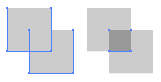
- Use Pathfinder's "divide" function to separate the objects, so that the overlapping area becomes a separate object that can be coloured with its own colour, which in this case would be a darker shade of black.
If you use the first technique, and you flatten the artwork, you basically get the same effect as the second technique, so I recommend using the Pathfinder technique. It's a lot more accurate, and you can avoid the problems inherent with transparency in Illustrator. Here's a screenshot of before and after using Pathfinder and applying a darker colour to the overlapping area:
You can also use QuarkXpress's "merge" feature, but it's not as powerful as Illustrator's Pathfinder. You'll have to use a combination of "intersection" and "difference" to achieve the same effect.
Use British spelling in your searches