Notes: Ooo!
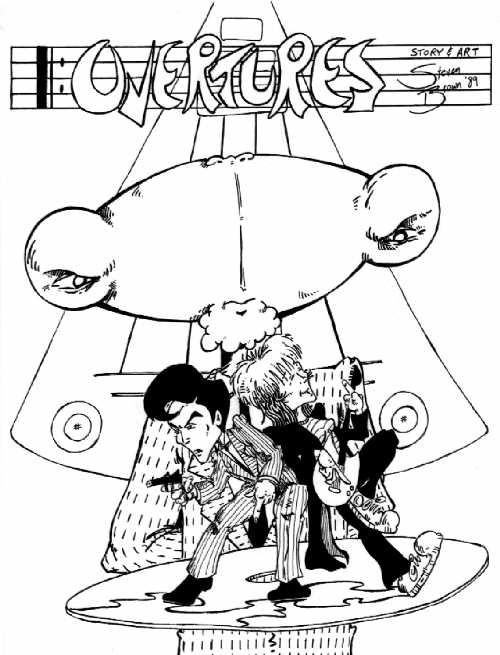
A cover ... and now a title page. Well, at least this one turned out the
way I pictured it in my head. I kind of like this one. Of course, it's
still all shakey freehand ... that CD they're standing sure isn't ROUND.
But still, the idea of the two characters standing back to back, the off
balance feeling of standing on the disk, the menacing figure in the middle
ground, and the shape that will have importance later on floating in the
background ... I think this worked pretty well.
Cautious Fuzz
was my first really deep experimentation with crosshatching. I did some
of it in Making the Grades,
but it's hard to get very deep in 4 panels crammed full of words. The relatively
open space of the comic book page let me try out lots of things (some of
which worked ... and some of which really didn't ... I mean, check out
the morse-code suit). I was reading a lot of Matt Howarth's comics at the
time (particularly Savage Henry and Kief Llama ... both of
which had strong influences on Cautious Fuzz) and he is a MASTER
of using ink lines to create texture and the illusion of color.
|
|
|
|
|
|
|
|
|
|
|
|
|
|
|
|
|
|
|
|
|
|
|
|
|
|
|
|
|
|
|
|
|
|
|
|