Notes:
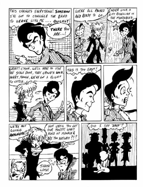
Looking at this page, I just run hot and cold. I REALLY like panel #1 ...
both Adler and the background (including the spotlight) work just the way
I pictured it in my head. But what's up with the lava-textured door in
panel #2? (And who stuck the starfish on the door ... that's just MEAN!)
The whole page is like that for me ... one image just the way I wanted
it, the next seeming rushed and sloppy. I WISH I'd been able to get a better
bug-eyed look out of Adler in panel #5. And while I like the layered feeling
in the final panel, none of the silhouetted figures seem to have the correct
posture. Or maybe it's that the floor is uneven (look at the horizon line).
I mean, Phred should be MUCH taller than Uncle Dog and Enich, and Droxine
should be half-a-head shorter.
|
|
|
|
|
|
|
|
|
|
|
|
|
|
|
|
|
|
|
|
|
|
|
|
|
|
|
|
|
|
|
|
|
|
|
|