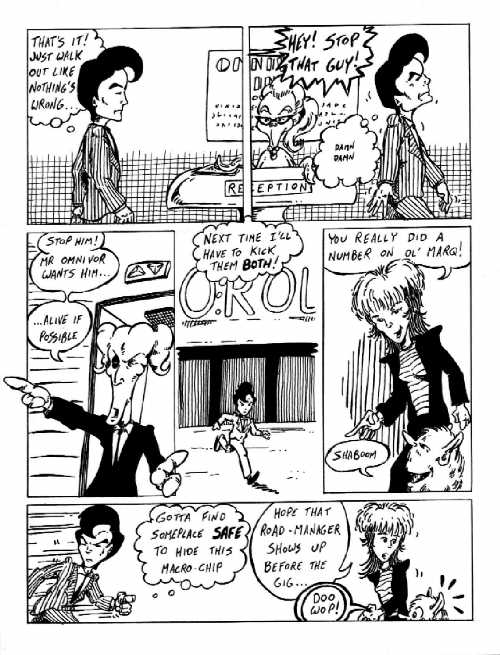
Notes: There's
lots of strange stuff going on with the crosshatching on this page, and
very little of it works the way I'd hoped. For the most part it's because
the patterns draw attention to themselves. In panel #s 1 & 2 I wanted
to create the feeling of there being depth without having to put real detail
into the wall behind the receptionist-thing. But the pattern is too uneven
and too close to the same weight in the stripes on Adler's suit. I have
NO idea what I was thinking in panel #3 ... that weird, almost speed line
style does the worst thing possible ... it stands out, but doesn't convey
any sort of information. I AM happy with panel #4, where I decided to put
crosshatching on the doors but NOT on Adler's suit. Panel #5 has an effect
I like when it's pulled off well: a "spotlight" of tone. But here my "spot"
is oblong and only shows on one side of the characters.
This page also
shows a challenge I somehow ALWAYS seem to create for myself: How to make
interesting panels that contain both tall, thin characters and extremely
short, squat ones. This problem never comes up during the sketch phase,
where panel and page restrictions never come into play. I create characters
that feel right on their own. But when you're trying to tell a story with
characters of such different heights, you sooner or later wind up with
panels like #6 ... where the short character has to stand on tip-toes just
to get into the frame.
|
|
|
|
|
|
|
|
|
|
|
|
|
|
|
|
|
|
|
|
|
|
|
|
|
|
|
|
|
|
|
|
|
|
|
|