Notes: Ooo!
There are LOTS of little things that interest me about this page! Let's
go panel by panel, shall we?
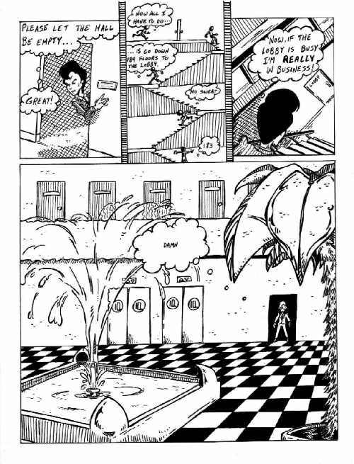
Panel #1: It
was challenging to create the idea of Adler looking out of a darkened room
without actually making the shadows inside solid black. (I wanted to save
all the solid black for the final panel just to heighten the contrast.)
I think that cross-hatching works, but that it would have worked BETTER
if I'd chosen to make the tone of Adler's shadow different. Right now there's
just so much similar linework going on that it all becomes a bit of a jumble.
Panel #2: I'm
rather proud of thinking of using the dead space between the panels to
create a set of walls to give the stairway a more claustophobic feeling.
Also, the use of drawing the same person multiple times in the same panel
(to create the illusion of quick movement) is one that I don't use very
often ... so I'm glad to see that it worked pretty well here.
Panel #3: I put
a very high forced perspective on the stairwell for a couple of reasons.
First, it adds (I think) to the impression that Adler is going quickly
down the stairs ... like the camera operator is going so fast to keep up
that his momentum is pulling him into strange positions. Second, although
Adler is going down the stairs, he is struggling to reach his goal ...
so I wanted to make a visual nod to him going uphill. The door might be
one floor down, but it is above Adler in the picture.
Panel #4: After
a page of scratchy tones, the solid black and white really gives me the
feeling of stopping and standing still. Adler is framed in the doorwaytrapped
by this open space. I'm actually VERY happy with the checker board pattern
on the floor. It is NOT zip-o-tone ... I actually broke down and used a
ruler for this one. It's not perfect, I know ... but it does look pretty
convincing.
I wanted the
lobby to have a very art deco feel to it (like many of the skyscrapers
in Manhattan do). I'm not sure I pulled that off, though, particularly
with the fountain (the corner pieces are all right, but the unwaveringly
straight lines of the sides just don't create the right mood). And I'm
really not sure what I was thinking with the palm tree. I DO like the water
effect from the fountain spray, though.
One more thing.
As much as I dislike my lettering throughout this story, I DO like the
way the "Damn!"s worked over the next page or two. This one in particluar.
A very tiny word in a very large thought bubble lends the single word a
lot of emotional weight.
|
|
|
|
|
|
|
|
|
|
|
|
|
|
|
|
|
|
|
|
|
|
|
|
|
|
|
|
|
|
|
|
|
|
|
|