Notes: See
what I mean about the amount of text being "abusive"? This seems to be
a problem at least once whenever I do a comic book story. I always seem
to have a notion or two that are important enough to need explaining, but
too dull to warrant giving more than half a page of visual real estate.
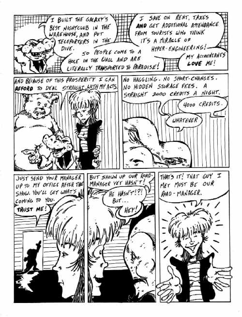
Do you see now
why I said these two pages work better as a spread? Open a new browser
window and flip back and forth. Layout wise they are mirror images -- 3
identical panels, 2 identical panels, 1 panel ... 1 panel, 2 identical
panels, 3 identical panels. What's more, even the cross-hatching is mirrored.
Vertical lines and solid black in the 3 panel spread on page 18, horizontal
lines and solid white in the 3 on page 19. Horizontal lines on the middle
2 on page 18, vertical on page 19. The two single panel lines both have
grid cross-hatching, but one has a circular white "spotlight" on the right,
while the other has the same thing on the left side.
Gar Dían
comes across as pretty predatory here (particularly in panel 3 on this
page, where he's supposed to look like a half-submerged croc). This is
a half jab, half homage to Kerry. You see, he was getting his MBA at the
time. And like MOST MBA students I know, he thought he was a pretty smooth
business shark ... ready to pounce on any opportunity to make obscene profit
off the system (and the unsuspecting public). But in the end, Kerry was
(and remains) too nice a person to be successfully sleazy. His alter ego,
however, is quite the little scuzzball.
Oh ... and way
to jump to conclusions, Droxine. That can't possibly come back to haunt
you later.
|
|
|
|
|
|
|
|
|
|
|
|
|
|
|
|
|
|
|
|
|
|
|
|
|
|
|
|
|
|
|
|
|
|
|
|